Alan D’Amore, UX/product designer, generalist working with AI.
I worked for Beyond 12 ↗ BeCurious ↗ Mi Jardín ↗
UX & Visual Designer
12.22 — 6.24
I focused on designing an experience that felt supportive, clear, and easy for students to use every day.
The work helped boost engagement, improve the flow of the coaching platform, and shape an AI product that students could trust and return to.
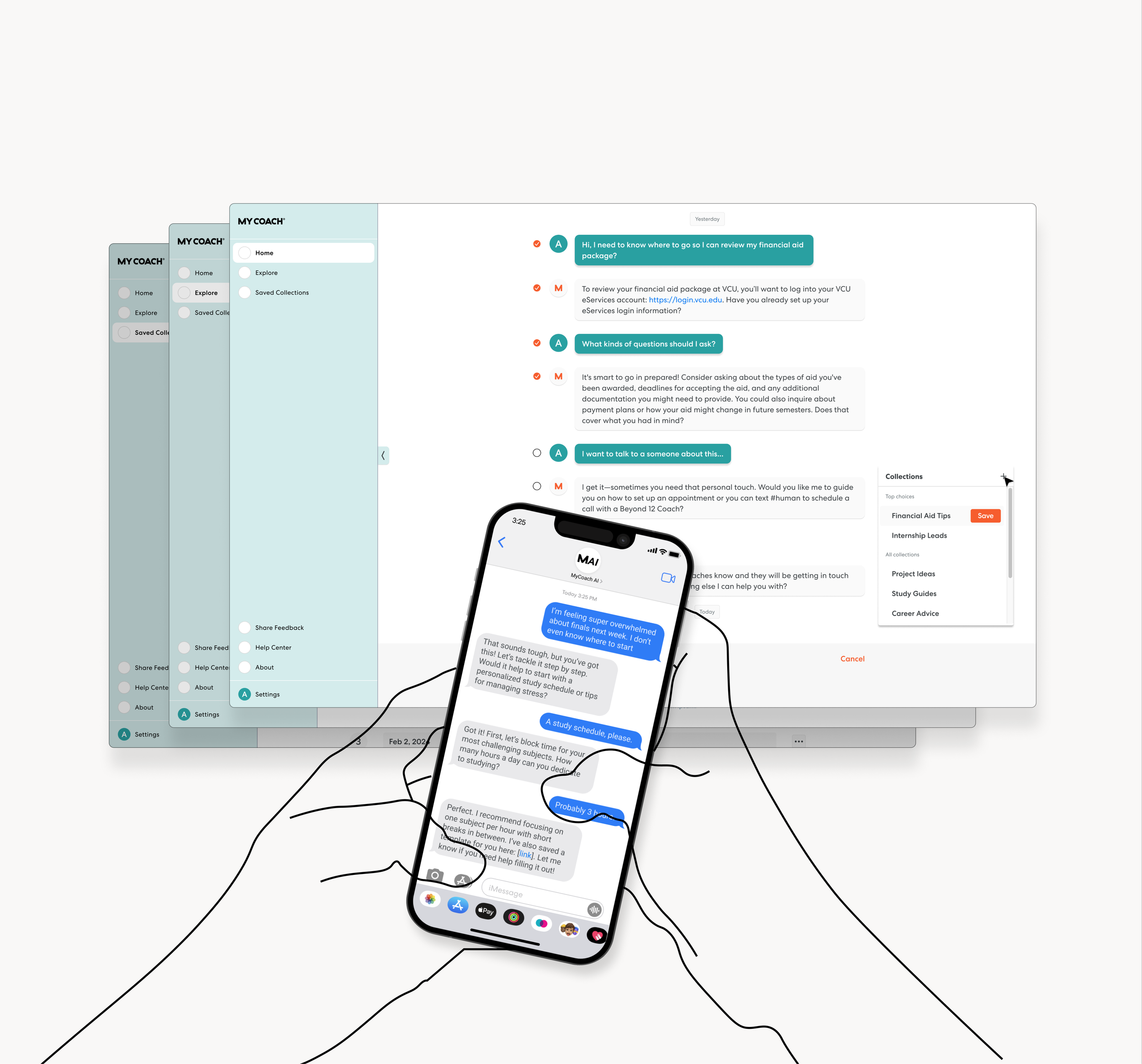
Designed the first generation of MyCoach AI, shaping an approachable, SMS-based coaching experience that lifted student engagement and made support feel immediate and human.
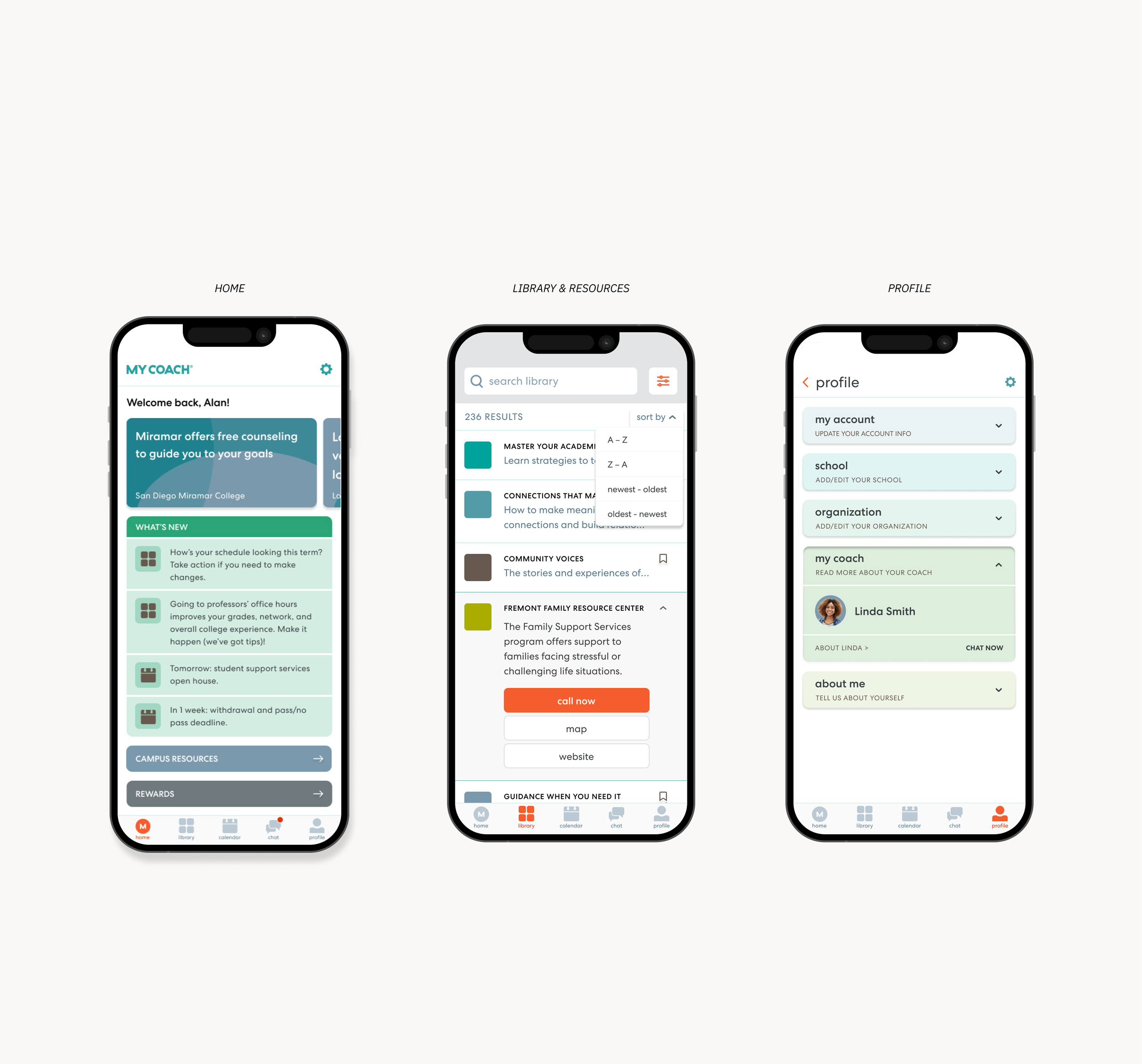
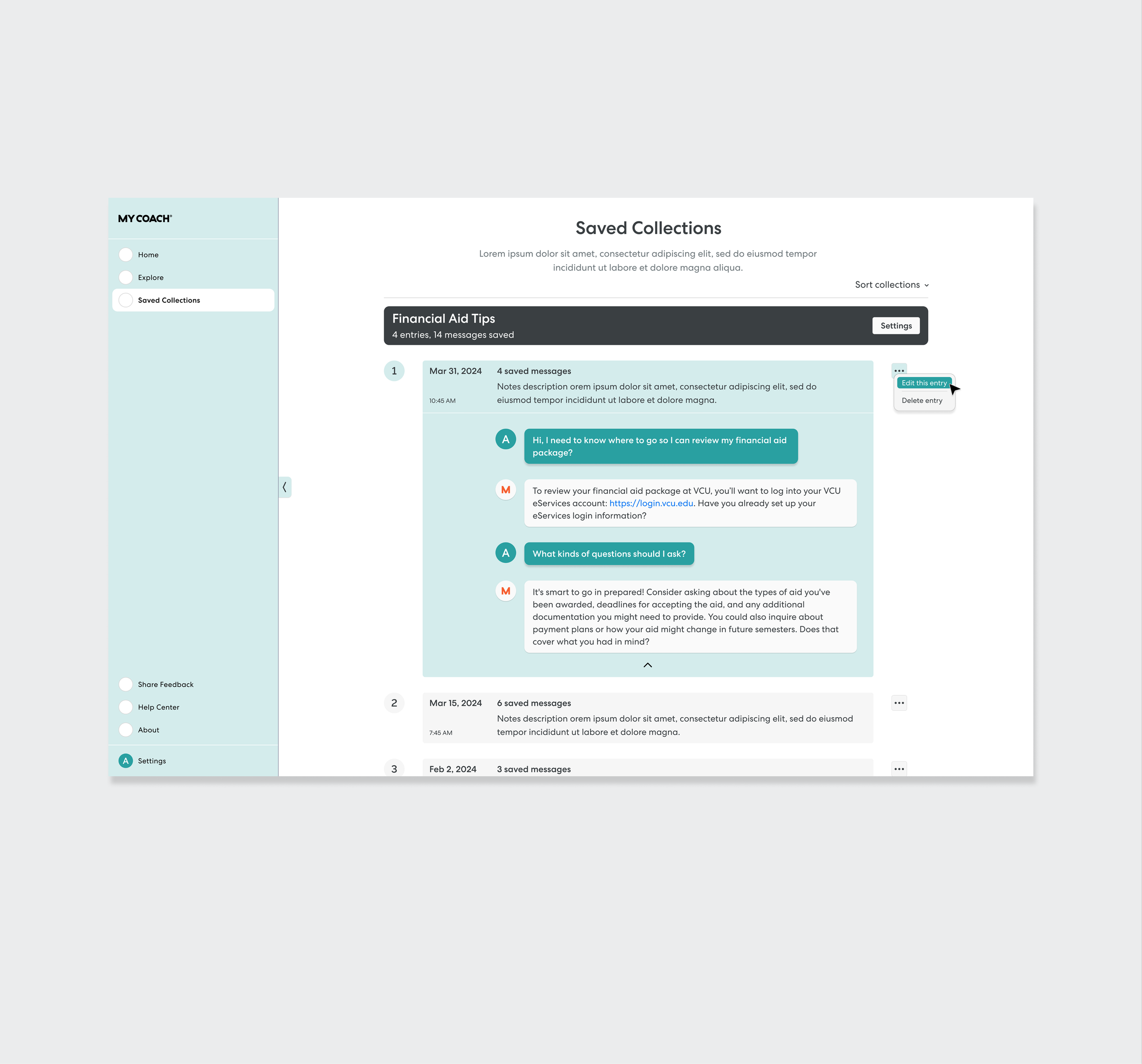
MyCoach App: Home, Profile, & Library ↗
Redesigned core areas of the MyCoach App to fix usability gaps, streamline daily tasks, and create a more accessible experience that students relied on throughout their journey.
A gen-AI powered tool for 1st generation college students
MyCoach AI
First-gen students have enough on their plates — navigating school, life, work — often without built-in support systems.
Beyond 12 already had a solid human coaching model, now the goal was to scale that 1:1 support.
We created MyCoach AI as a coach in their pocket that met them wherever they were, offering support in the moments they actually needed it.
This section maps out my UX thinking. It's basically an essay so here's the tldr;
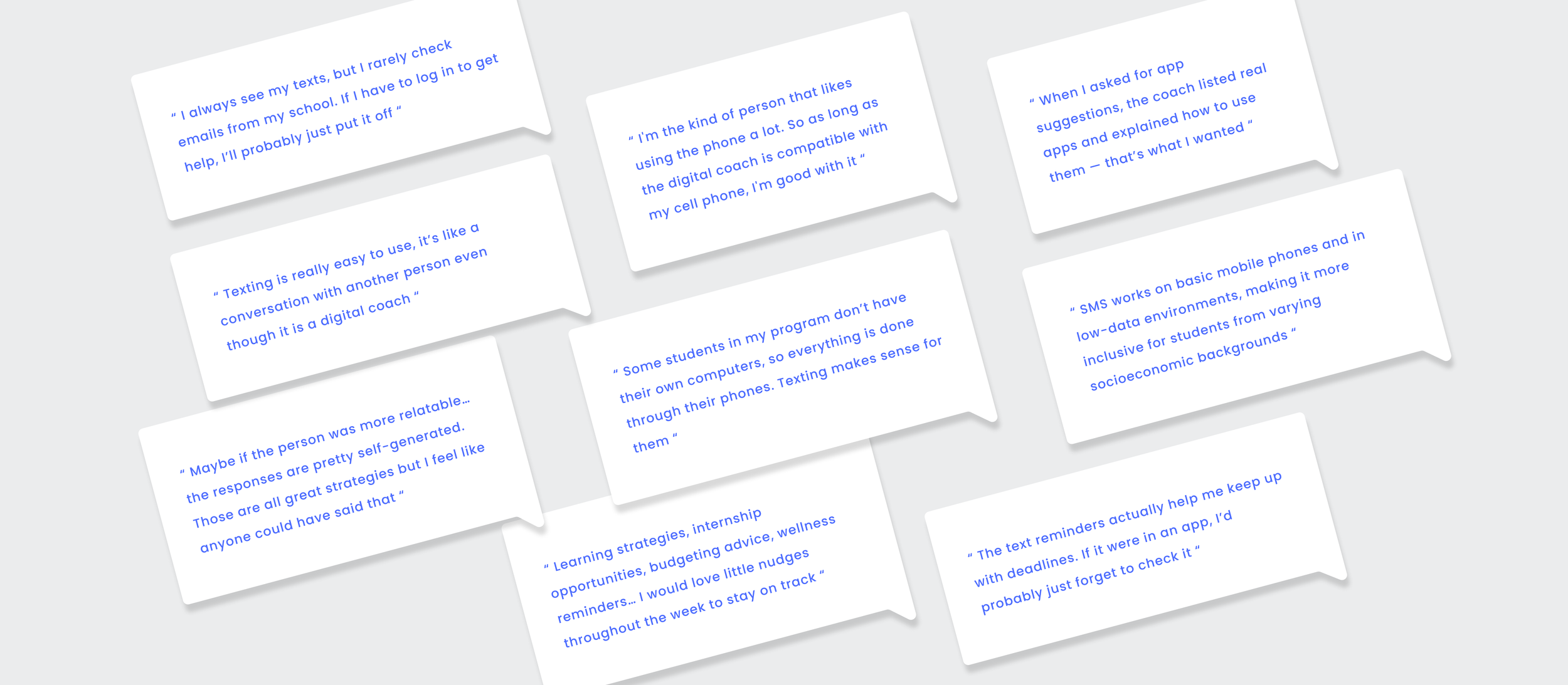
Through co-led research, user testing, and prototype exploration, I uncovered engagement patterns and pain points, surfacing early signals of what students needed. My insights and design prototypes helped the team validate an SMS-first approach that made coaching more accessible and supportive.
- - -
Design Process
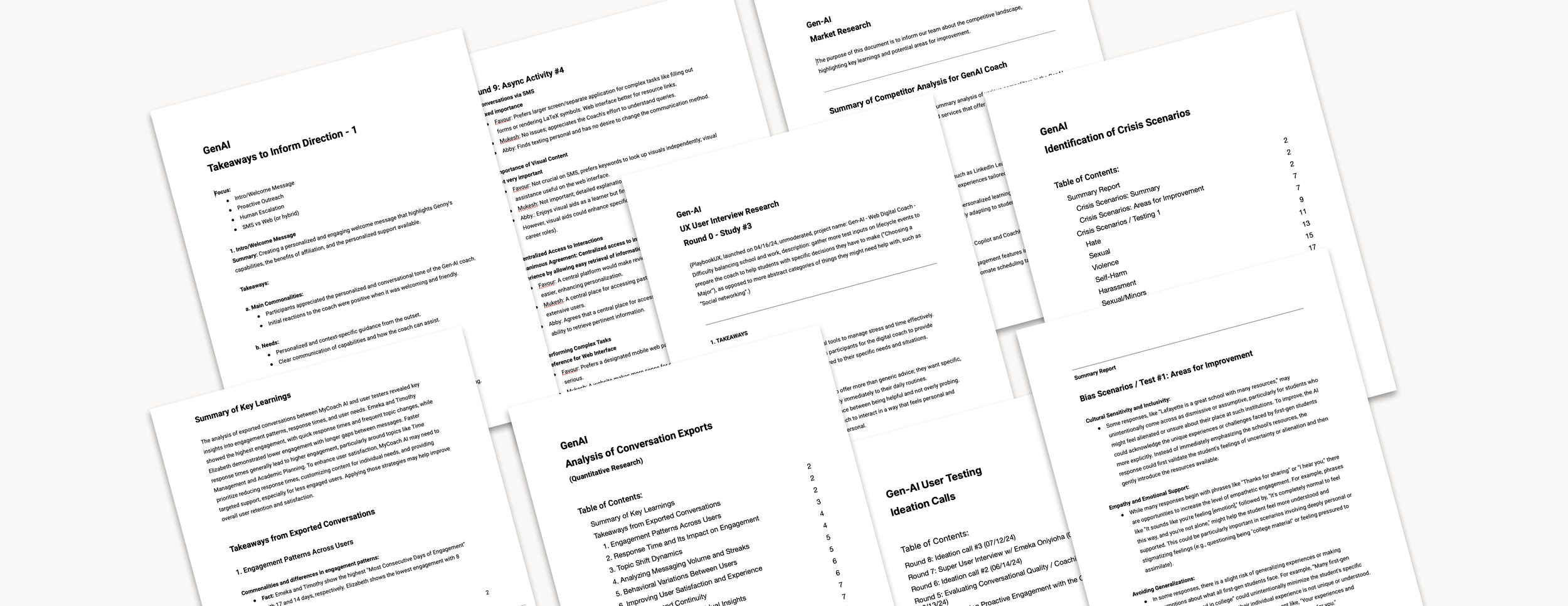
I kicked off the project with a two-month research phase, speaking with more than twelve students across different majors, ages, and backgrounds to uncover key insights. We used a mix of methods, including UX Playbook, ideation calls, 1:1 interviews, and weekly sessions with a small group of super users.
I partnered closely with the Senior PM to run interviews, test prototypes, and review real coaching conversations to understand what blocked engagement. My focus was on surfacing pain points, translating insights into opportunities, and producing design variations we could put in front of students to guide us toward a strong first pilot.
Issues identified:
Students were unsure how a digital coach should fit into their daily habits
No clarity yet on which platform would lower barriers and encourage consistent use
Early flows felt too scripted and not human enough
Schools needed something they could deploy instantly without IT lift
Students wanted support that they could trust and that felt conversational, not like intake paperwork
- - -
I then supported the team in defining priorities and shaping what we would test first, balancing feasibility with user impact.
- - -
Before moving into design, each design solution was evaluated based on engineering workload and its potential impact on both users and the business.
Core design phases:
Student interviews, advisor insights, behavior mapping
MVP scope, constraints, cross-functional alignment
Multiple flow variations across SMS + web
Tone checks, A/B tests, iterative prototyping
Finalizing scalable flows and human escalation patterns
- - -
UX Challenges
Designing an AI coach for first-gen students came with several tricky constraints.
Key challenges:
SMS engagement vs limited UI; web features vs login friction
Making AI feel genuinely human and trustworthy, not scripted
Supporting students with low tech access
Designing personalization that feels helpful, not intrusive
Ensuring schools could adopt quickly with no IT setup
Identifying bias and crisis gaps in early AI behavior
Creating a smooth, empathetic handoff to human coaches
Key Solutions
SMS-first flow that removed friction and boosted engagement
Identified best approaches, training AI for a more empathetic conversation
Uncovered student needs and contributed to features that increased response depth, raised attendance, and strengthened trust
SMS-first
Prioritized SMS to cut friction. No logins, no portals, just instant access that scaled faster and met the students where they were.
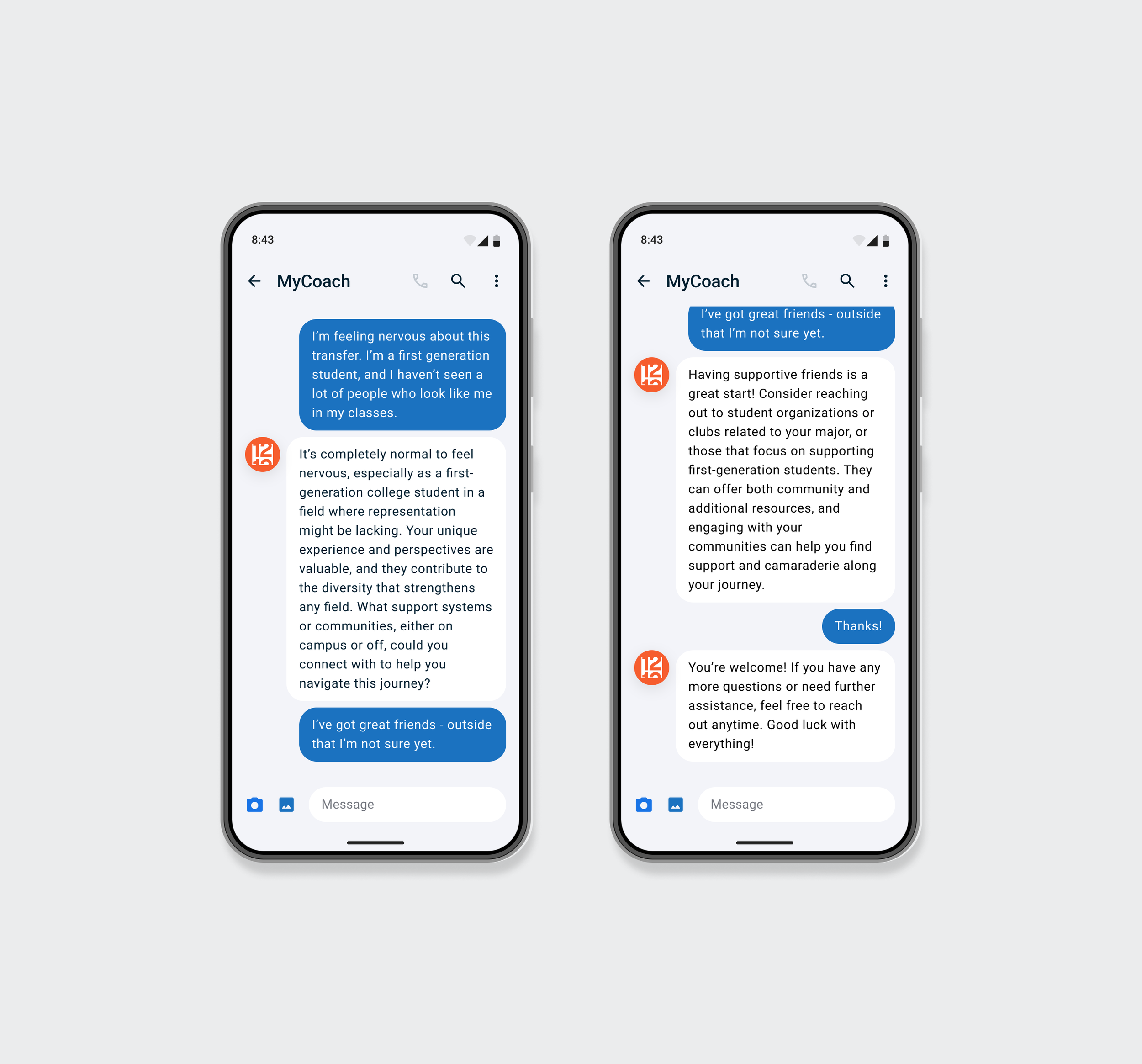
Conversational patterns
Created and refined response styles that blended coaching principles with a warm, approachable tone to reduce friction and increase clarity.
Human escalation flow
Helped shape a gentler transition to real coaches through an empathy-first message that reduced no-shows and guided students with more confidence.
Developed and tested bias and crisis response pathways.
Ran targeted scenario tests across coach versions to refine tone, ensure safe escalation, and strengthen the AI’s ability to handle sensitive moments without breaking trust.
Proactive outreach
Developed variations of check-ins and follow-ups that improved responsiveness and helped students stay on track without requiring a login.
Scalable onboarding & personalization
Designed an institution-agnostic onboarding flow that made rollout simple for schools and instantly accessible for students.
Metrics
→ Increased coaching attendance from 40% to 85%
→ Institutions onboarded instantly with no IT setup required
→ 2x increase in daily engagement and retention
Lead UX / UI designer
01.22 — 6.22
BeCurious
At BeCurious, a New York based design agency, I helped turn a complicated golf app into an experience that felt faster, clearer, and far more accessible.
My work focused on removing friction, refining core flows, and giving the product a structure that both newcomers and power users could trust.
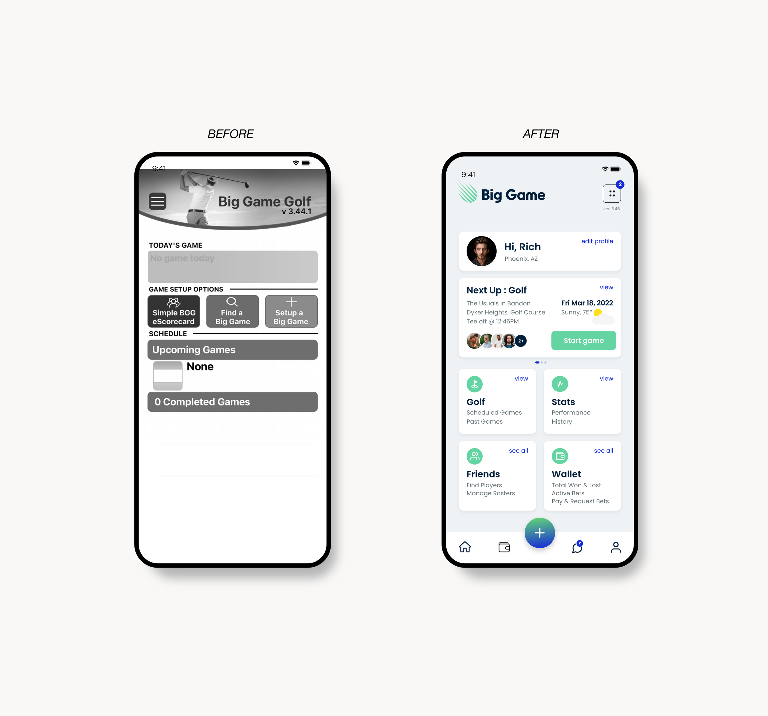
Led UX for the Big Game redesign, running the initial design sprint and co-building the UI foundation that transformed a complex golf app into a cleaner, faster, and more beginner-friendly product.
A golfing app designed for every level of golfer
Big Game Golf App
Big Game had strong features but was too complex and clunky for most users. The aim was to streamline the experience and turn it into a fast, intuitive app for every level of golfer.
This section explains how I approached the UX work. If you’re skimming, tldr;
Through interviews, a focused design sprint, and a full redesign of the game creation flow, I removed friction, clarified complex betting rules, and built a modular system that made setup 40% faster and far easier to understand.
- - -
Design Process
Before touching screens, we dug into user habits, pain points, and the messy complexity of the original experience.
Research & Alignment
Ran a remote design sprint to align the team and define core goals
Conducted 10+ interviews and usability tests across new and experienced golfers
Studied betting formats, golf rules, and player behaviors to understand real pain points
- - -
Issues Identified
Game setup was slow and confusing
Betting rules were unclear and intimidating for new players
No clear hierarchy or guidance for first-time flows
High cognitive load during “Create New Game”
Scattered navigation and limited social engagement
No quick entry point for casual play
- - -
UX Challenges
Big Game’s biggest hurdles were rooted in the product’s depth — dense rules, layered game logic, and a setup process that confused even experienced players.
Making a betting heavy experience understandable for new and casual golfers
Balancing depth for power users with simplicity for newcomers
Clarifying contest formats with multiple rules, variations, and dependencies
Reducing setup time without removing necessary options
Supporting flexible game creation where users can jump between steps without losing progress
Designing a system flexible enough to scale into other sports
- - -
Approach
Prioritized the “Create New Game” flow as the core journey
Mapped dependencies and simplified betting logic with the client
Split features into MVP vs nice-to-have
Built prototypes for rapid feedback loops and structured client reviews
Moved into a full redesign with scalable components and a clean system for handoff
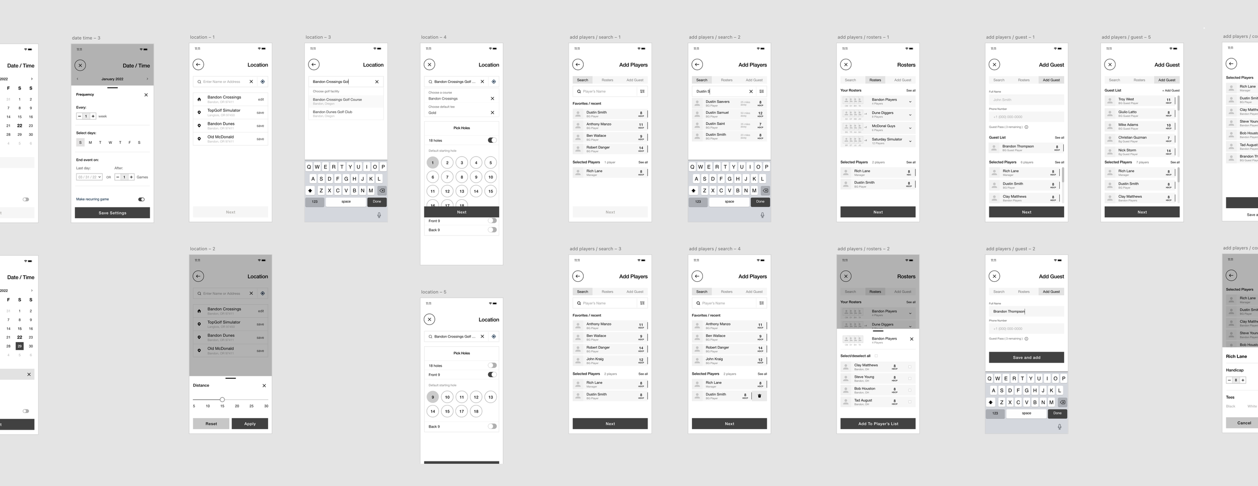
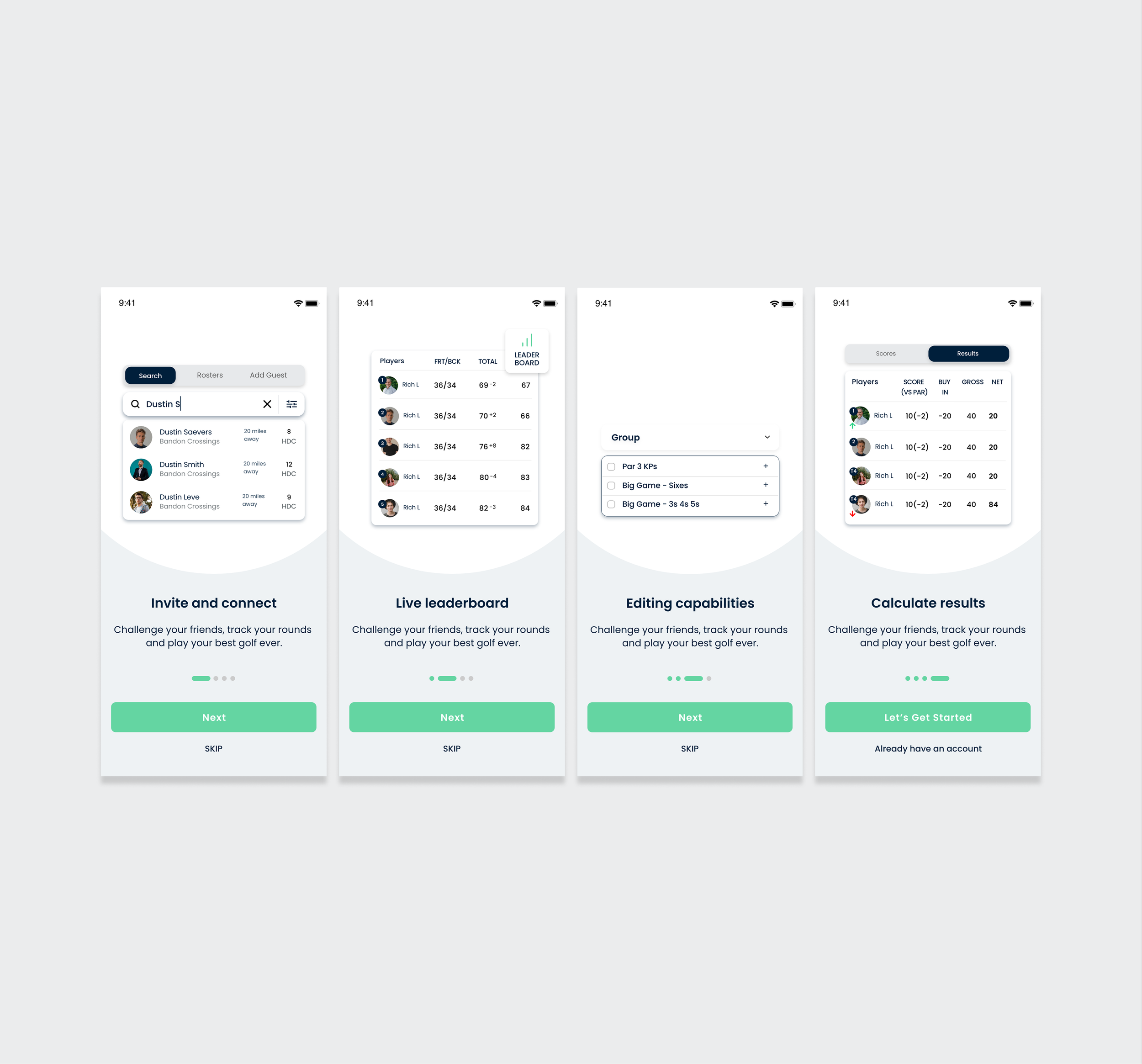
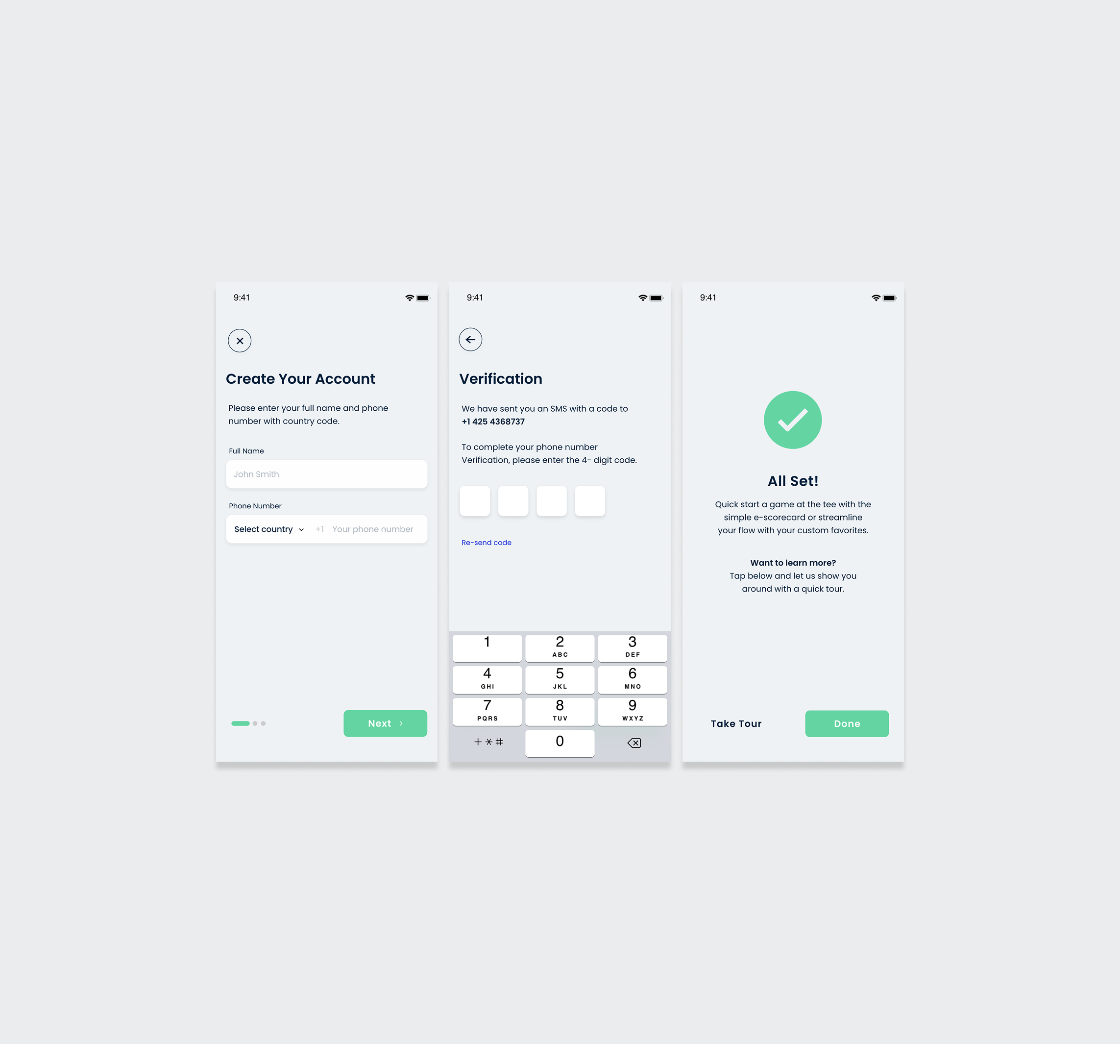
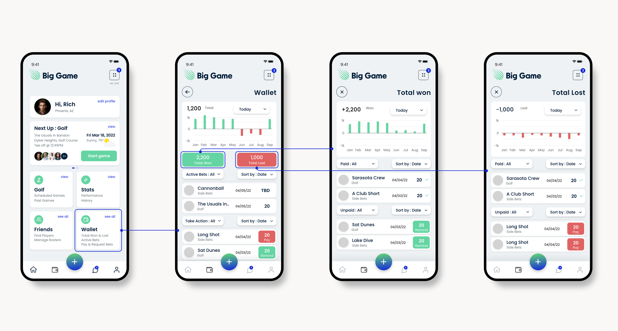
Create new game flow, wireframes
Create new game flow, final UI
Key Solutions
Create New Game Overhaul
Rebuilt the entire flow into a flexible, non-linear setup that cut setup time by 40 percent.
Added Favorites so users could recreate games instantly.
Quick Play
Designed a one tap e-scorecard for casual players who want to start fast with zero configuration.
Clear Contest Descriptions
Introduced simple, structured explanations of betting formats to reduce confusion and boost confidence.
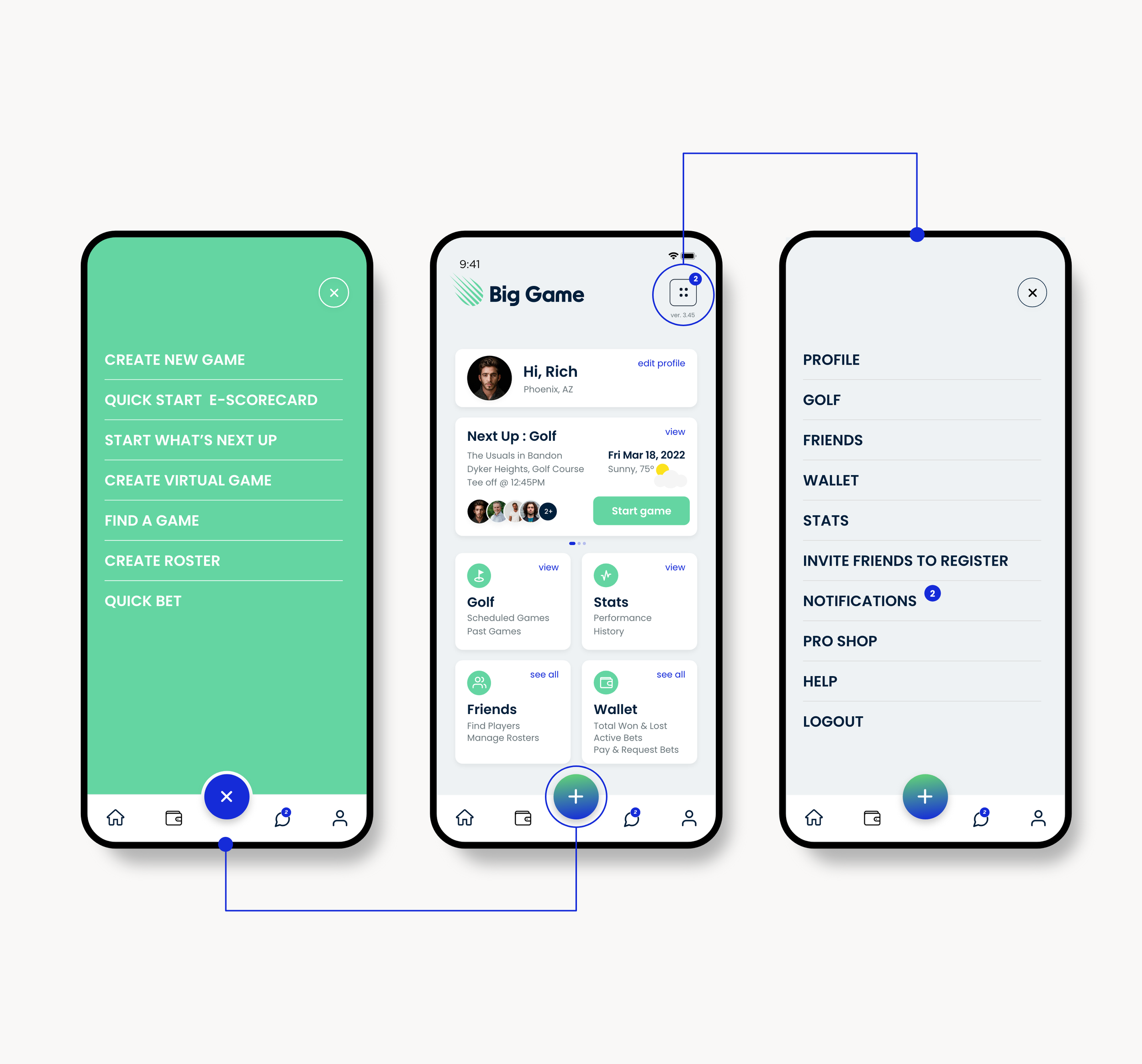
Modular Home Screen System
Built widget based navigation to highlight core actions and allow future expansion.
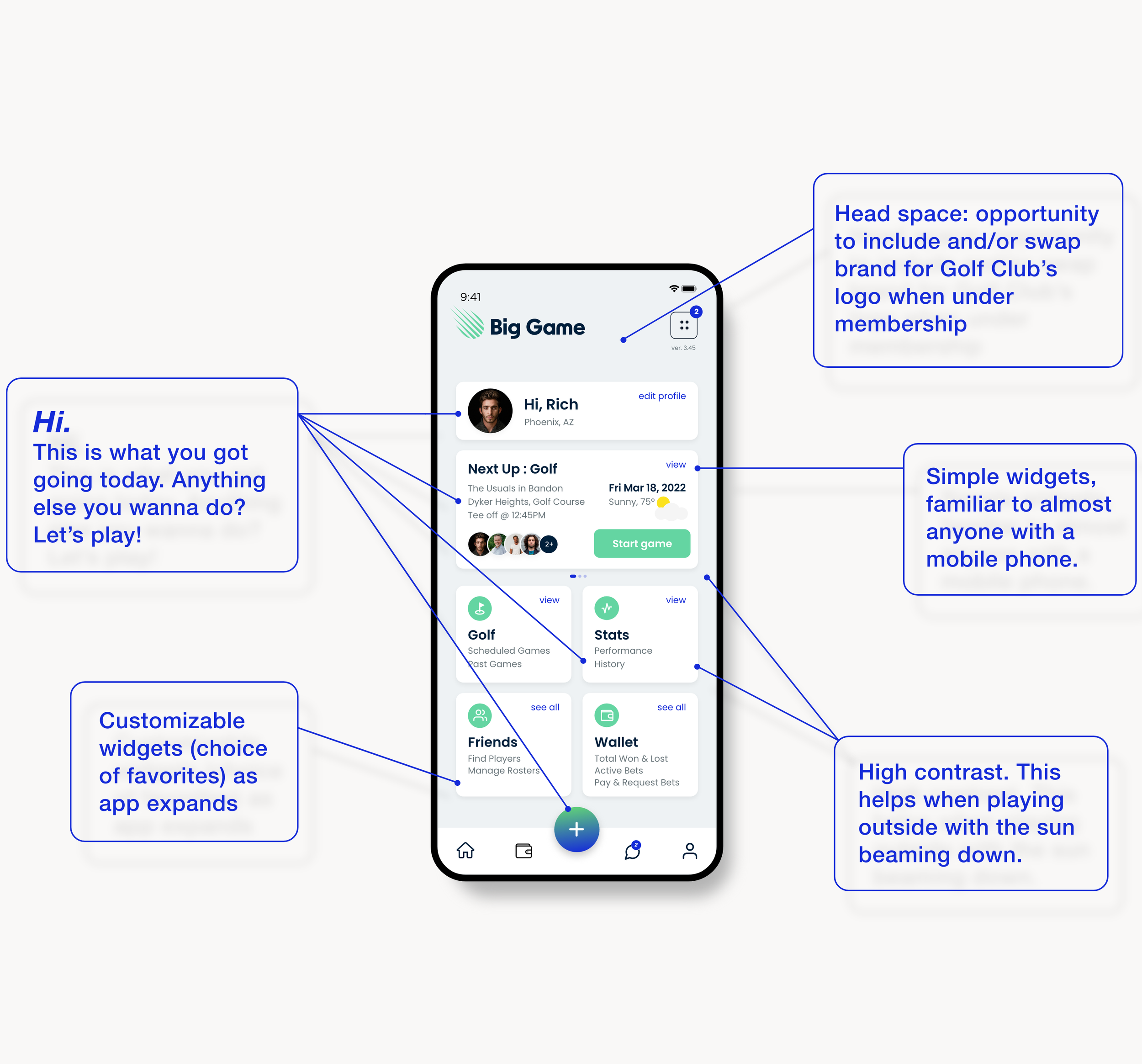
Game Hub
Centralized all games, invites, and results into one intuitive space
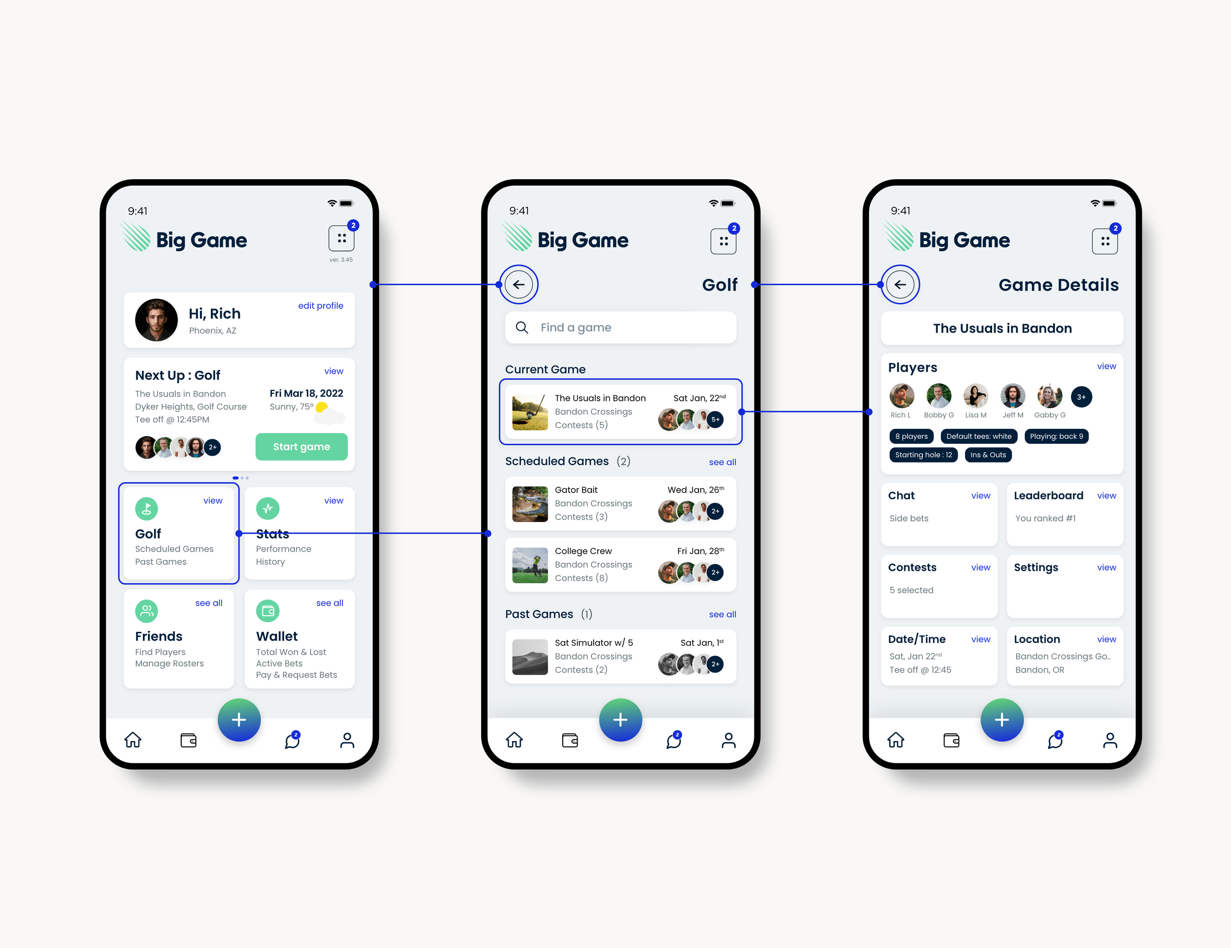
Social Layer Enhancements
Auto chat creation for each game.
In chat betting to merge social behavior with gameplay.
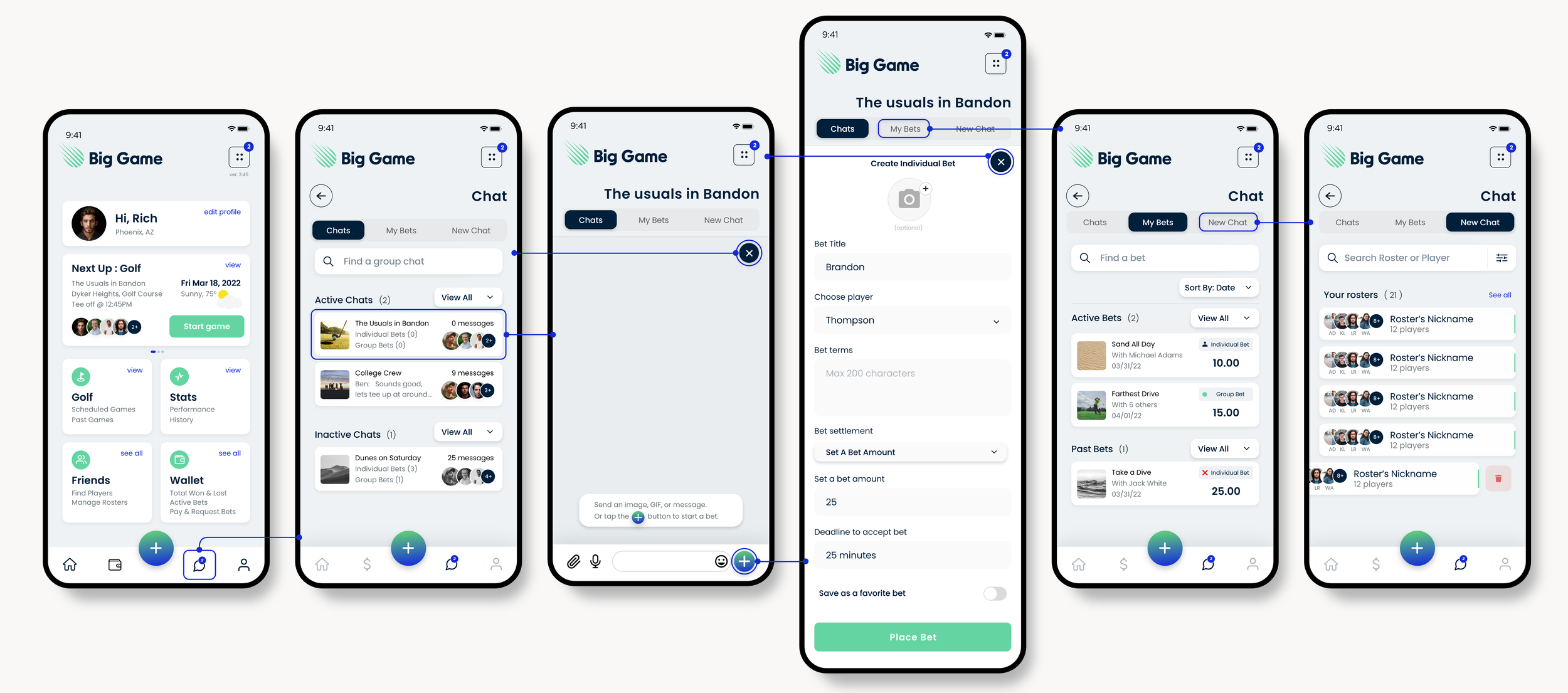
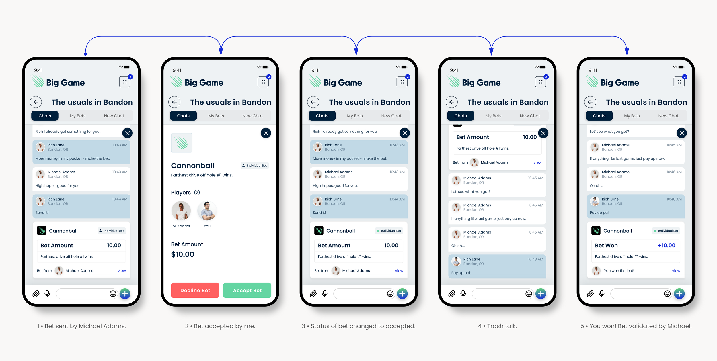
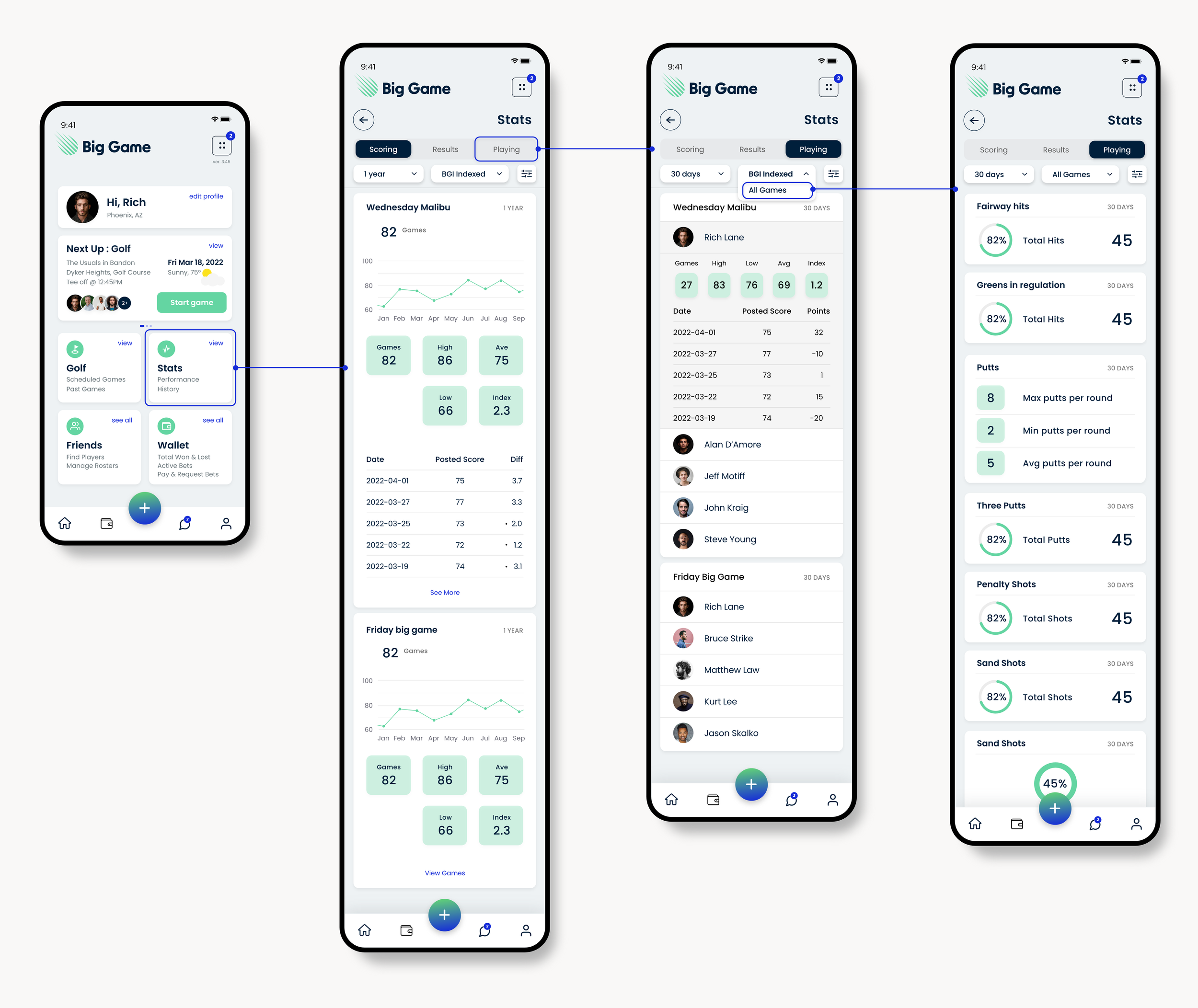
Stats & Wallet
Created simple tools for friendly competition without financial complexity.
Metrics
→ Higher user confidence during setup due to clearer contest descriptions and streamlined navigation (validated in usability testing)
→ 40% faster game setup
→ Strong adoption and positive feedback for chat-based betting, cited repeatedly as a top engagement driver
Brand strategist / creative director
06.25 — current
Mi Jardín
While working directly with Mi Jardín’s founders, I led the brand strategy and creative direction for a wellness brand rooted in the Andes.
The work centered on aligning story, identity, and packaging to create an authentic brand that felt both handcrafted and commercially viable.
I Delivered a complete identity system that drove a 20 percent sales increase and secured wholesale partners within weeks of launch.
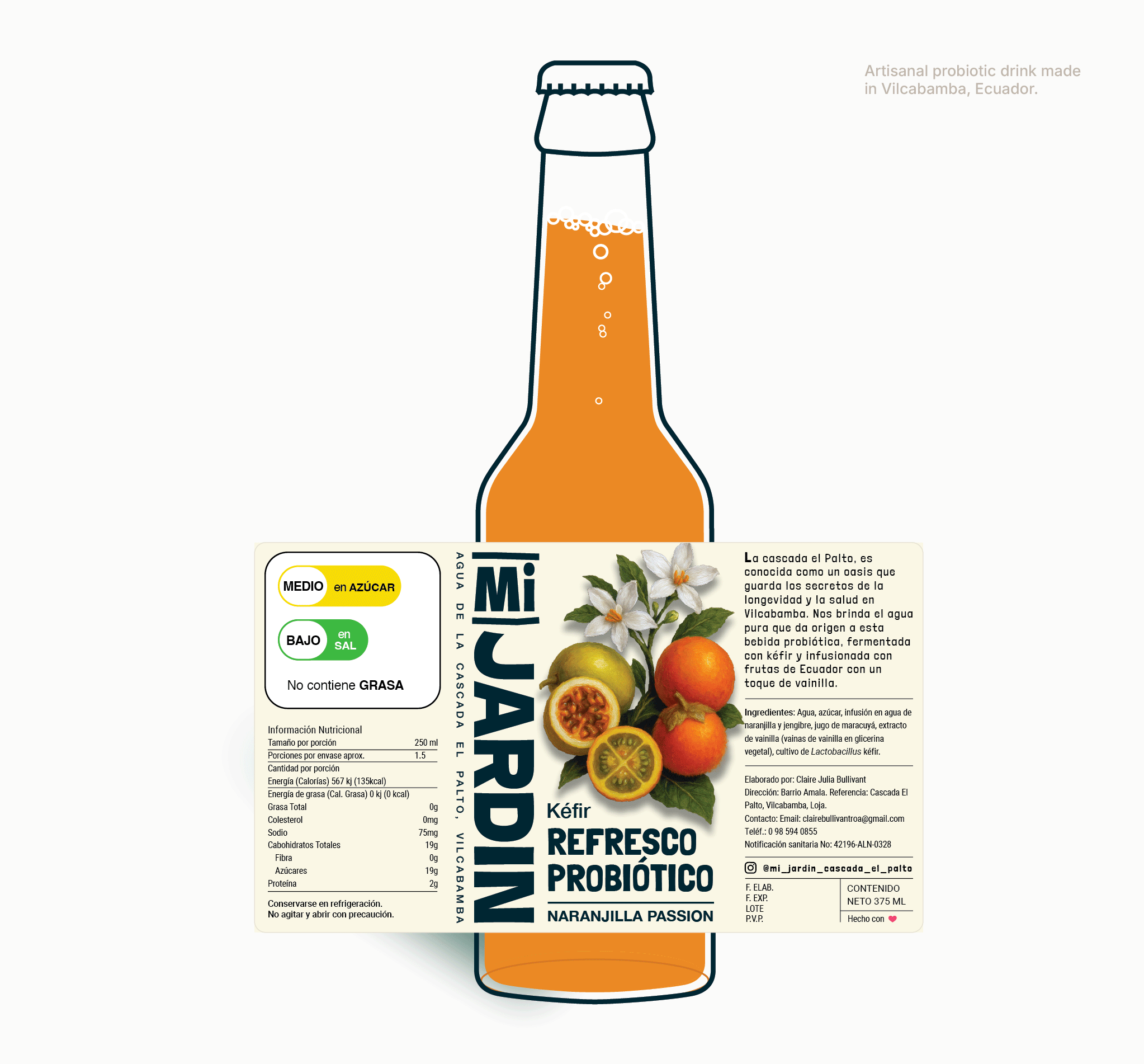
A scalable wellness brand system ready to expand across products and channels.
Mi Jardín
Mi Jardín’s products are made slowly, sustainably, and by hand in the Andes of Ecuador.
The challenge was ensuring the brand reflected that authenticity while still working in a real market.
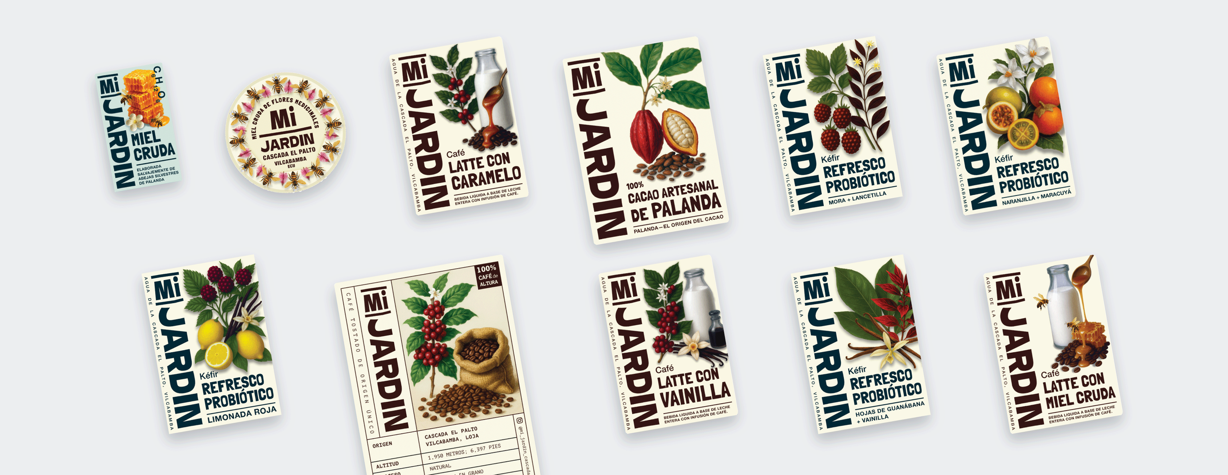
I designed a brand and packaging system that felt honest, grounded, and ready to scale.
This section outlines my brand strategy. It’s a deeper dive, so here’s the tldr;
Mi Jardín needed a brand that reflected its land, values, and production reality. I built the brand from the ground up, aligning identity, packaging, and storytelling to create a product that felt honest, artisanal, and rooted in place. Early label tests validated the direction, driving immediate sales lift and wholesale interest with no paid promotion.
- - -
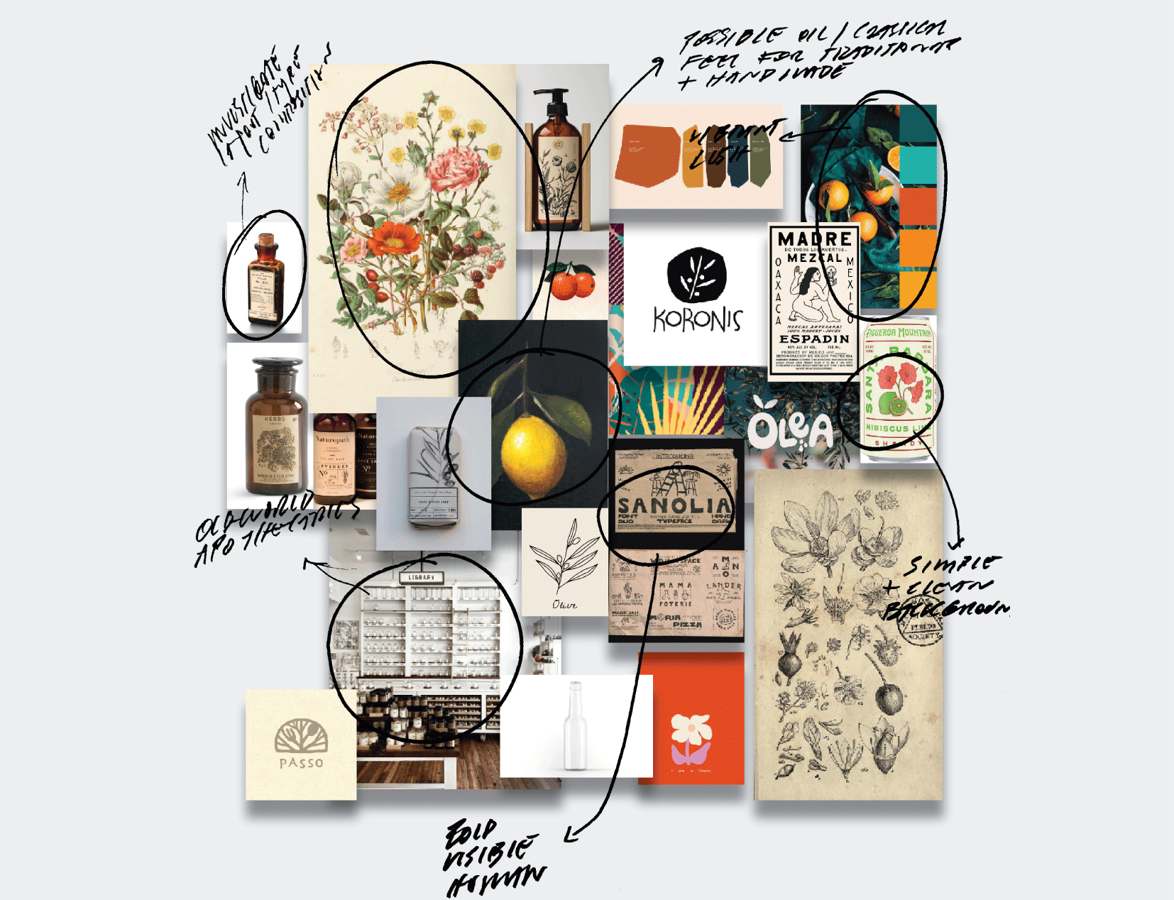
Design Process
Before any visual direction was explored, the first phase focused on understanding what was missing and what needed clarity.
Early issues
No cohesive brand system across products
Packaging lacked consistency and hierarchy
Brand story existed, but was not visible at shelf level
No clear structure for future product expansion
Visual identity did not yet reflect the depth of the production process
- - -
With those gaps clear, the work shifted toward redefining how the brand should function long-term.
I approached Mi Jardín as a living brand system, grounding every decision in the environment, production methods, and the need to scale without losing authenticity.
Strategic focus
Treat the brand as an extension of land and process
Balance handcrafted cues with modern clarity
Design for growth while respecting small-batch integrity
Build a system that could evolve without constant redesign
- - -
Once aligned, the focus moved to exploration, iteration, and validation.
Process highlights
Collaborative working sessions with the founders
Multiple visual directions to test tone and positioning
Rapid mockups to support discussion and decision-making
Iterative refinement based on feedback and real-world constraints
Continuous alignment between brand, packaging, and future expansion
- - -
Brand Challenges
Mi Jardín presented unique challenges that required balancing authenticity with real-world usability and growth.
Key challenges
Translating an off-grid, hands-on production process into a clear brand story
Avoiding a look that felt either too rustic or too commercial
Creating packaging that worked across many product types and formats
Designing for local markets while remaining credible for wholesale expansion
Building trust quickly with customers unfamiliar with the farm or its story
Key Solutions
A cohesive brand identity grounded in wellness and place
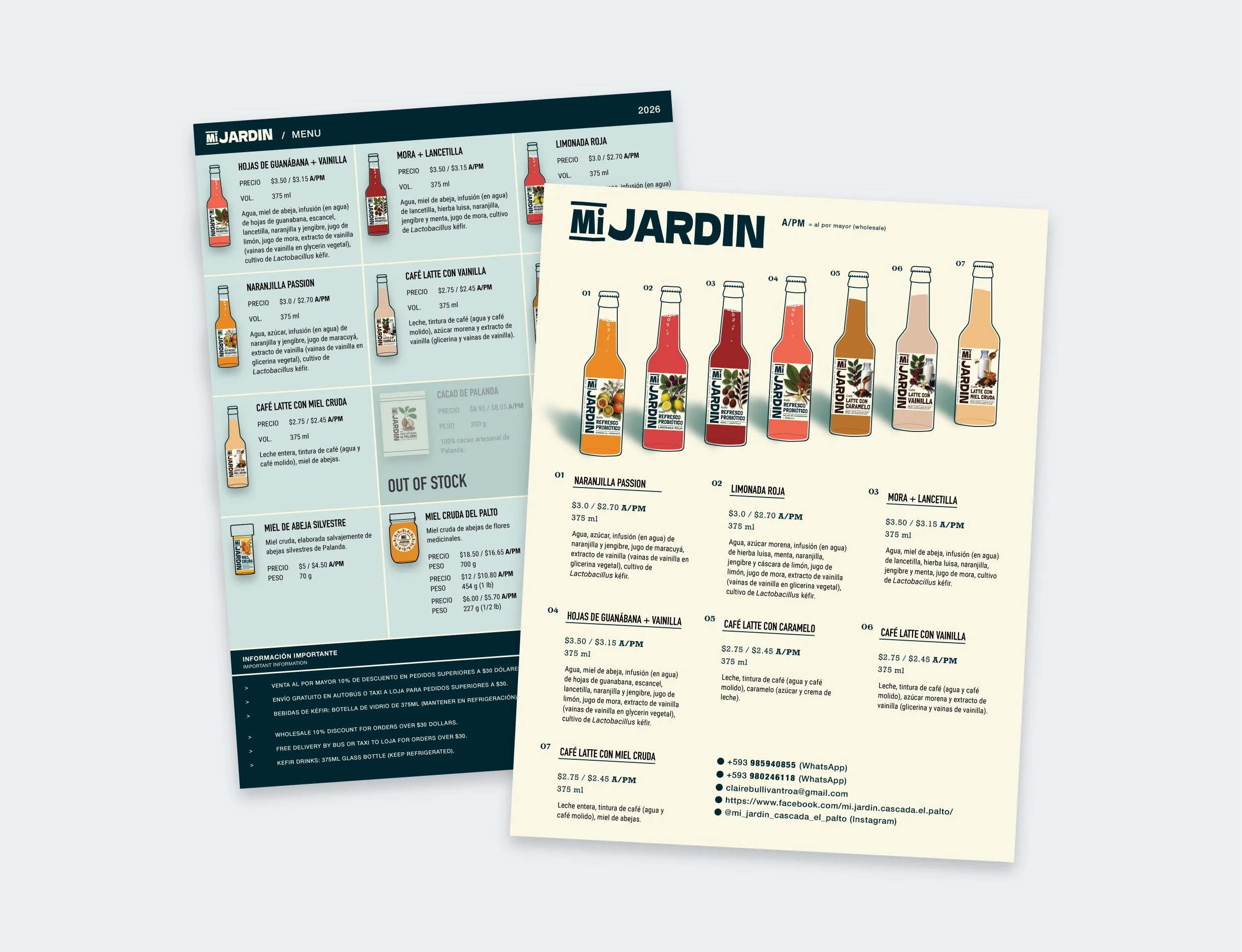
A modular packaging system adaptable across product types
Clear brand hierarchy supporting future product lines
Label designs optimized for shelf clarity and trust
A scalable visual system validated through early market success
We prioritized market validation over a full website, launching first through local shops and Facebook. This soft launch increased sales by 20 percent, landed five wholesale accounts, and positioned the brand for larger retail partnerships now in progress.
With the brand foundation and packaging system in place, the next phases focus on extending Mi Jardín into market presence, visibility, and long-term independence.
The goal is to carry the same clarity, authenticity, and scalability into how the brand shows up in the world and grows beyond its initial launch.
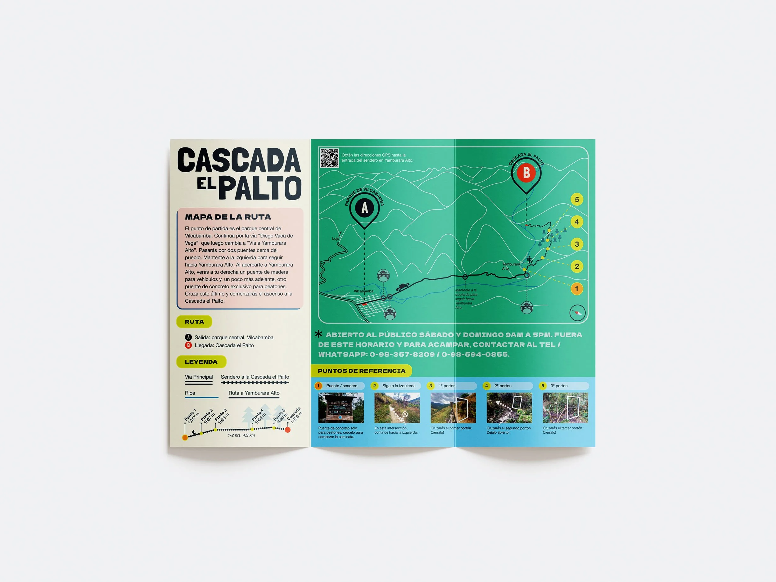
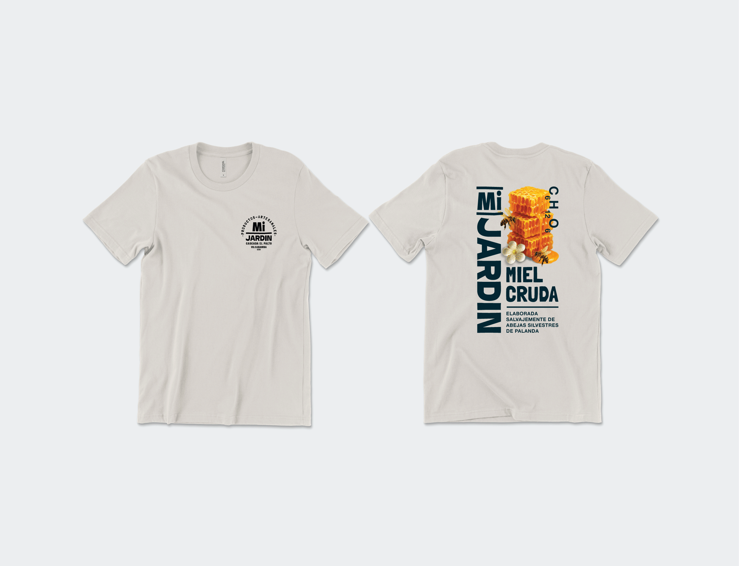
Ph3: Marketing Materials and Merchandise
This case study captures the project as it enters Phase 3 of brand development.
Planned deliverables
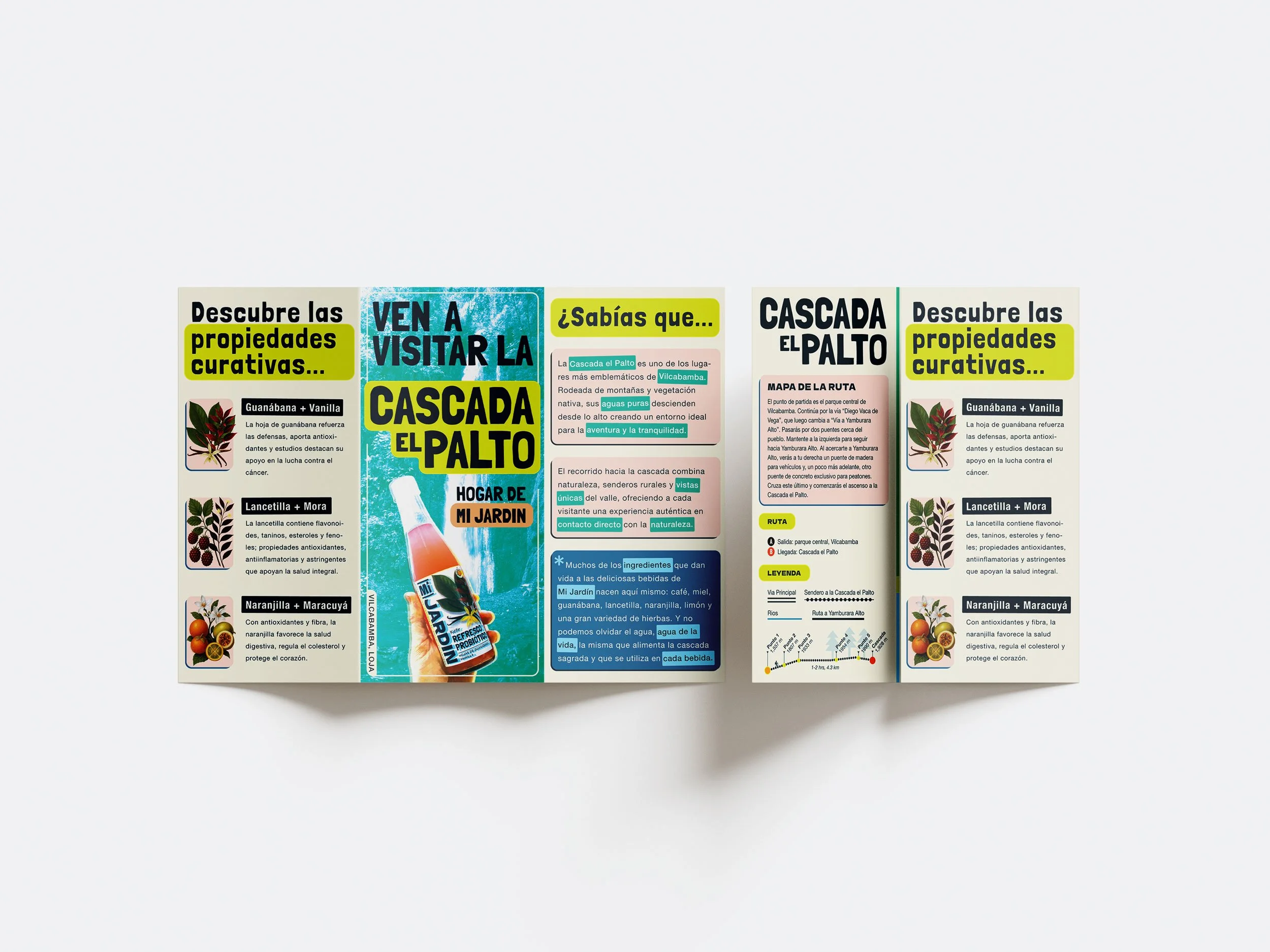
Point-of-sale materials for local markets and retail partners
Branded merchandise to extend visibility beyond the product itself
Low-cost, high-impact assets designed for local distribution
Visual consistency across in-person touchpoints
What’s Next
Ph4: Social Media Strategy and Active Marketing
This phase shifts the brand from presence to participation, using storytelling to build familiarity and trust.
Planned deliverables
Web development with optimized SEO & CRM systems in place
A defined content strategy and posting rhythm
Visual templates for posts, reels, and stories to speed production
Story-driven content highlighting the farm, process, and people
Systems that allow the founders to manage content independently
Ph5: Packaging Refinement and Brand Guidelines
This final phase focuses on longevity, clarity, and handoff.
Planned deliverables
Ongoing refinement of packaging as new products launch
A complete brand guideline system covering identity, typography, color, and usage
Documentation that supports consistent future execution
A self-sustaining brand toolkit for long-term growth
Metrics
→ 20 percent increase in sales following the test launch of the new brand and packaging, with no paid promotion
→ 5 new wholesale clients secured through a soft launch using local shops and Facebook
→ 11 product labels designed and deployed, validating the scalability of the brand system across multiple SKUs