UX & Visual Designer
03.24 — 11.24
MyCoach AI
First-gen students have enough on their plates — navigating school, life, work — often without built-in support systems.
Beyond 12 already had a solid human coaching model, now the goal was to scale that 1:1 support.
We created MyCoach AI as a coach in their pocket that met them wherever they were, offering support in the moments they actually needed it.
This section maps out my UX thinking. It's basically an essay so here's the tldr;
Through co-led research, user testing, and prototype exploration, I uncovered engagement patterns and pain points, surfacing early signals of what students needed. My insights and design prototypes helped the team validate an SMS-first approach that made coaching more accessible and supportive.
- - -
Design Process
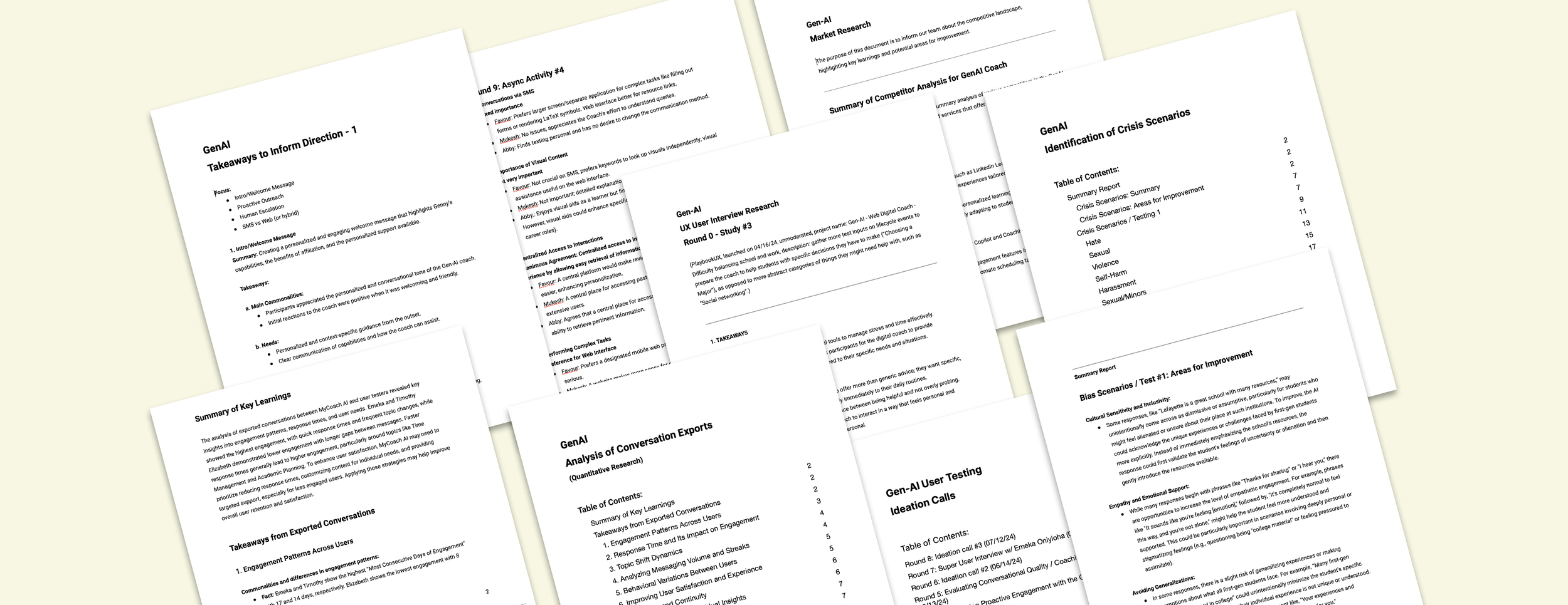
I kicked off the project with a two-month research phase, speaking with more than twelve students across different majors, ages, and backgrounds to uncover key insights. We used a mix of methods, including UX Playbook, ideation calls, 1:1 interviews, and weekly sessions with a small group of super users.
I partnered closely with the Senior PM to run interviews, test prototypes, and review real coaching conversations to understand what blocked engagement. My focus was on surfacing pain points, translating insights into opportunities, and producing design variations we could put in front of students to guide us toward a strong first pilot.
Issues identified:
Students were unsure how a digital coach should fit into their daily habits
No clarity yet on which platform would lower barriers and encourage consistent use
Early flows felt too scripted and not human enough
Schools needed something they could deploy instantly without IT lift
Students wanted support that they could trust and that felt conversational, not like intake paperwork
- - -
I then supported the team in defining priorities and shaping what we would test first, balancing feasibility with user impact.
- - -
Before moving into design, each design solution was evaluated based on engineering workload and its potential impact on both users and the business.
Core design phases:
Student interviews, advisor insights, behavior mapping
MVP scope, constraints, cross-functional alignment
Multiple flow variations across SMS + web
Tone checks, A/B tests, iterative prototyping
Finalizing scalable flows and human escalation patterns
- - -
UX Challenges
Designing an AI coach for first-gen students came with several tricky constraints.
Key challenges:
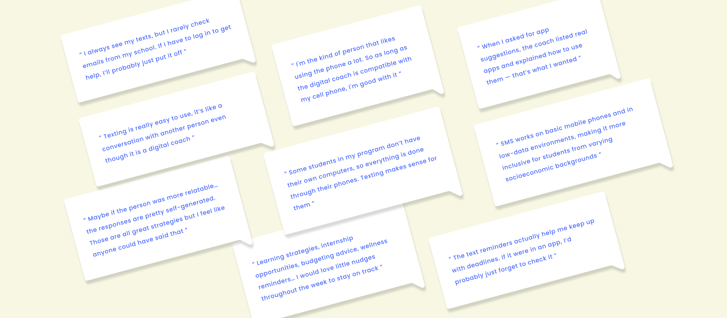
SMS engagement vs limited UI; web features vs login friction
Making AI feel genuinely human and trustworthy, not scripted
Supporting students with low tech access
Designing personalization that feels helpful, not intrusive
Ensuring schools could adopt quickly with no IT setup
Identifying bias and crisis gaps in early AI behavior
Creating a smooth, empathetic handoff to human coaches
Key Solutions
SMS-first flow that removed friction and boosted engagement
Identified best approaches, training AI for a more empathetic conversation
Uncovered student needs and contributed to features that increased response depth, raised attendance, and strengthened trust
SMS-first
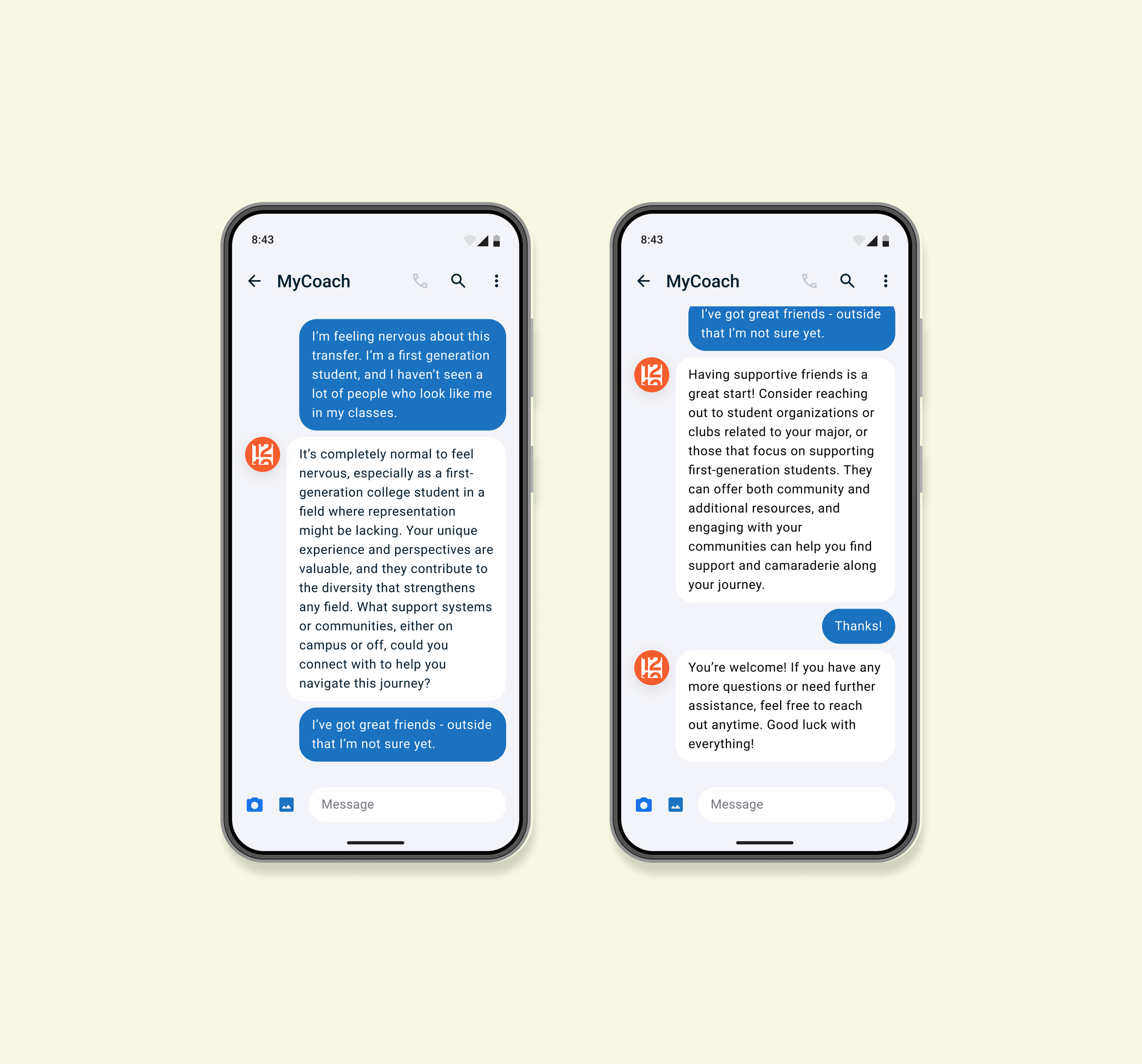
Prioritized SMS to cut friction. No logins, no portals, just instant access that scaled faster and met the students where they were.
Conversational patterns
Created and refined response styles that blended coaching principles with a warm, approachable tone to reduce friction and increase clarity.
Human escalation flow
Helped shape a gentler transition to real coaches through an empathy-first message that reduced no-shows and guided students with more confidence.
Developed and tested bias and crisis response pathways.
Ran targeted scenario tests across coach versions to refine tone, ensure safe escalation, and strengthen the AI’s ability to handle sensitive moments without breaking trust.
Proactive outreach
Developed variations of check-ins and follow-ups that improved responsiveness and helped students stay on track without requiring a login.
Scalable onboarding & personalization
Designed an institution-agnostic onboarding flow that made rollout simple for schools and instantly accessible for students.
Metrics
→ Increased coaching attendance from 40% to 85%
→ Institutions onboarded instantly with no IT setup required
→ 2x increase in daily engagement and retention
UX & visual designer
12.22 — 06.25
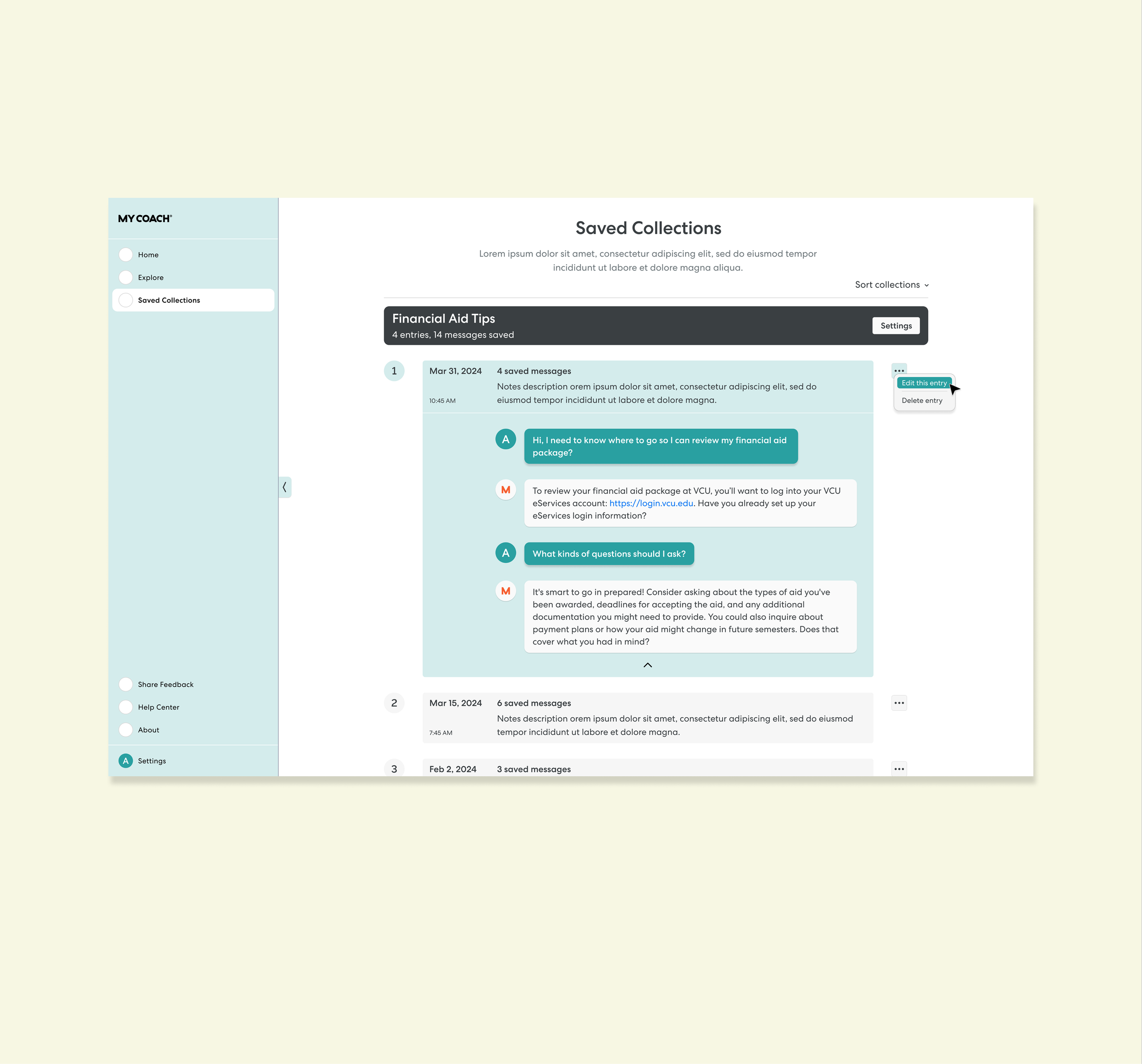
MyCoach App Redesign
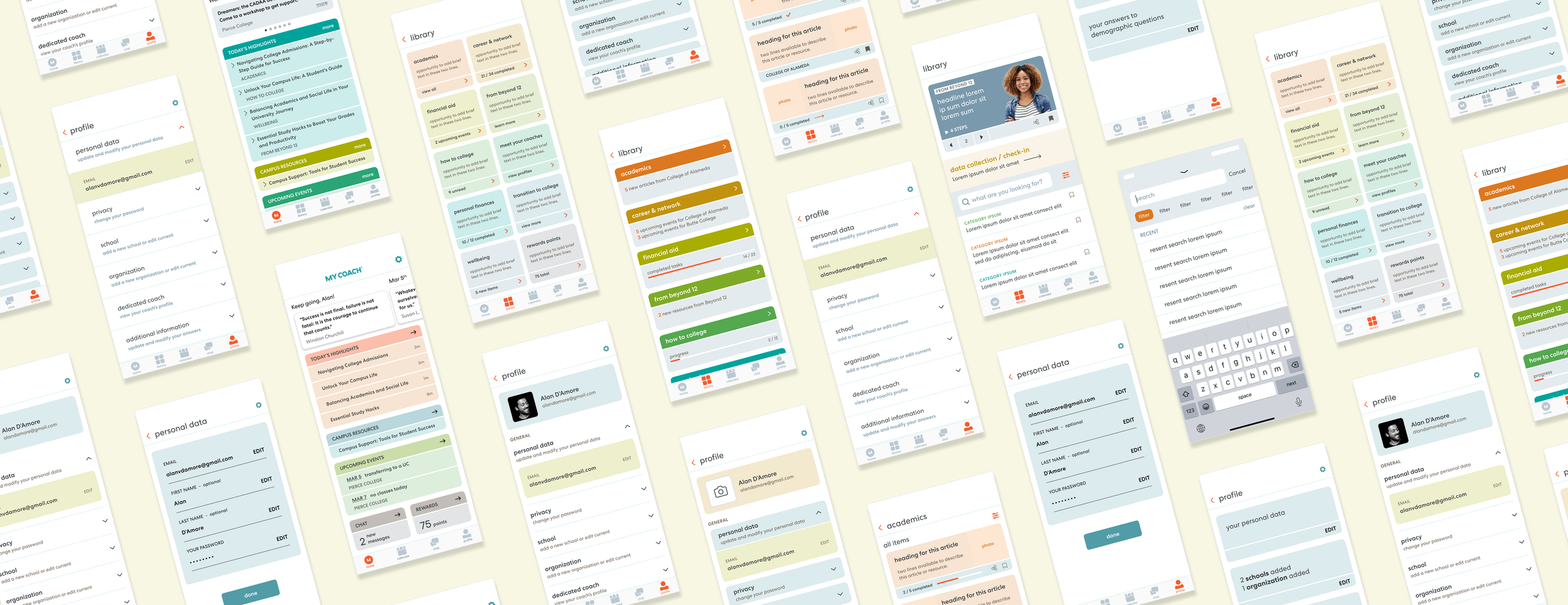
I led UX design across three core areas of the MyCoach app: Home, Library, and Profile, with the goal of improving engagement, clarity, and everyday usability without increasing development complexity.
The work focused on turning fragmented, underutilized surfaces into a cohesive product experience that felt motivating, intuitive, and scalable for a growing student population.
What changed, at a glance. If you’re skimming, tldr;
Home: Transformed the home screen into a personalized, motivational hub that surfaced what mattered most with minimal cognitive load.
Library: Rebuilt the library into a searchable, filterable system that made content and resources easy to find and worth returning to.
Profile: Simplified a cluttered profile into a single, structured surface where students could clearly view and manage their information.
- - -
Design Process
How the work unfolded across the app
I approached the redesign as a system-level effort rather than isolated screens, balancing student needs, stakeholder goals, and strict development constraints.
- - -
Issues identified
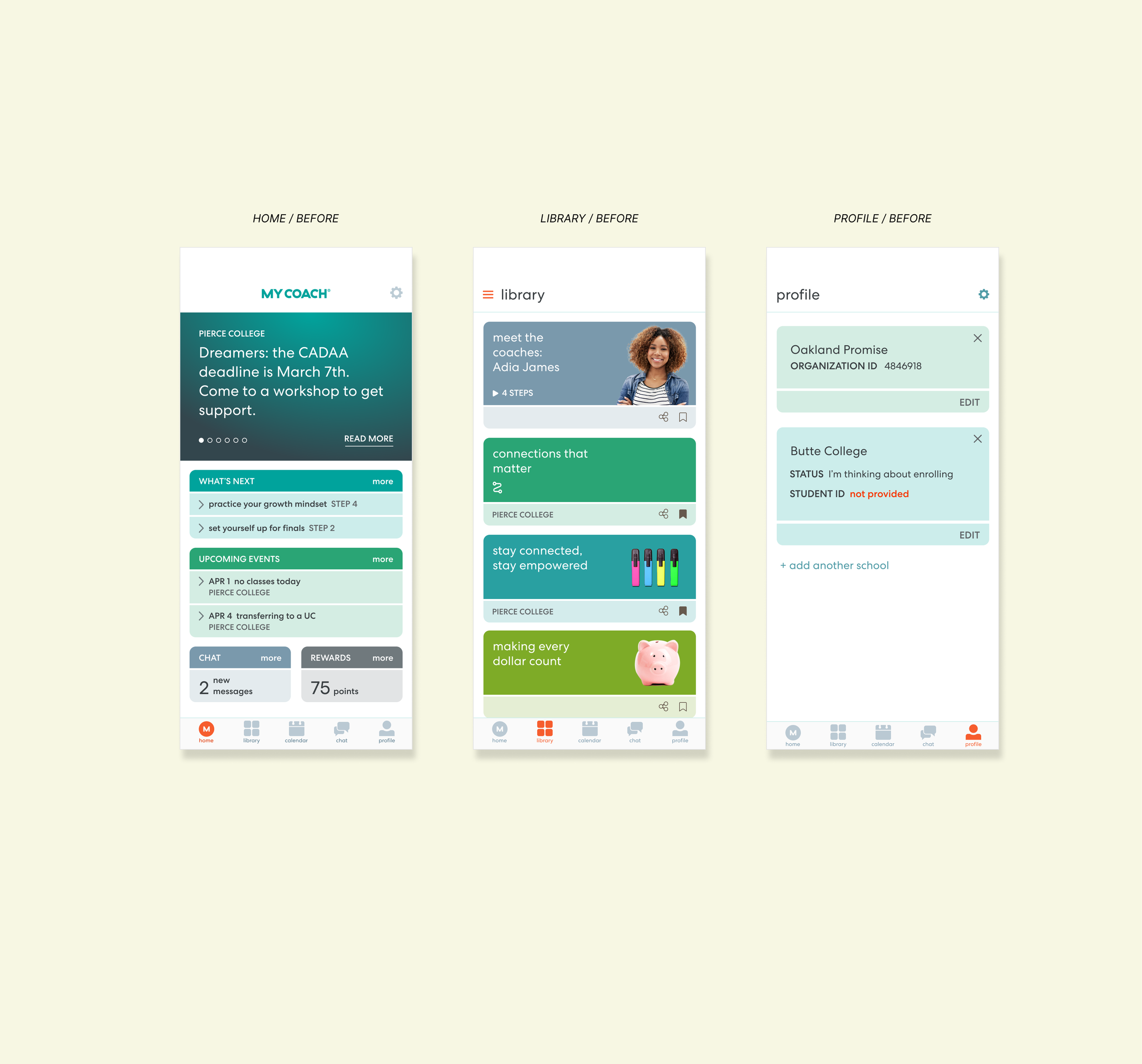
High cognitive load caused by dense text, unclear hierarchy, and fragmented navigation.
Key features existed but were difficult to discover or understand.
Students struggled to find relevant content, manage their information, or know what to do next.
Design ambition needed to stay tightly aligned with developer bandwidth.
- - -
UX Challenges
The complexity behind the redesign
Each surface had unique challenges, but they shared common UX friction points that required a holistic solution.
Home: Balancing personalization and motivation without overwhelming students or overloading development effort.
Library: Making a large, growing content system usable without infinite scrolling, hidden filters, or disconnected resources.
Profile: Consolidating scattered, hard-to-edit information into a single, understandable experience without adding technical complexity.
System-wide: Creating consistency across screens while serving very different user needs and interaction patterns.
- - -
Core design phases
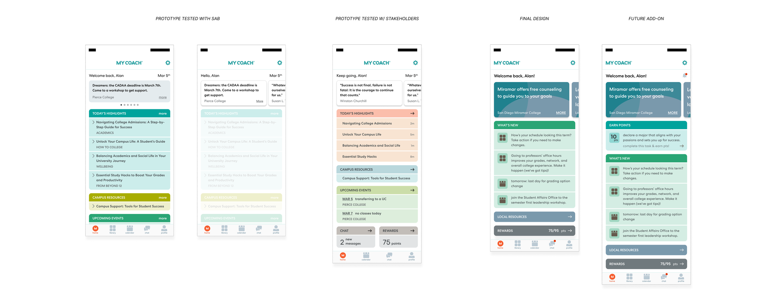
Research & empathy: Student Advisory Board interviews, stakeholder reviews, and qualitative feedback to surface real usage pain points.
Iterative prototyping: Rapid wireframes and mid-fidelity prototypes tested with students and internal teams to validate clarity and usefulness.
Refinement & alignment: Adjusted hierarchy, copy, and visual structure to maximize impact while staying technically feasible.
Validation: Final designs reviewed against engagement goals, usability improvements, and scalability considerations.
Key Solutions
What moved the product forward
The solutions focused on clarity, hierarchy, and ease of use, while respecting real-world constraints.
Clear content hierarchy
Personalization with purpose
Search-first thinking
Unified information architecture
Development-conscious design
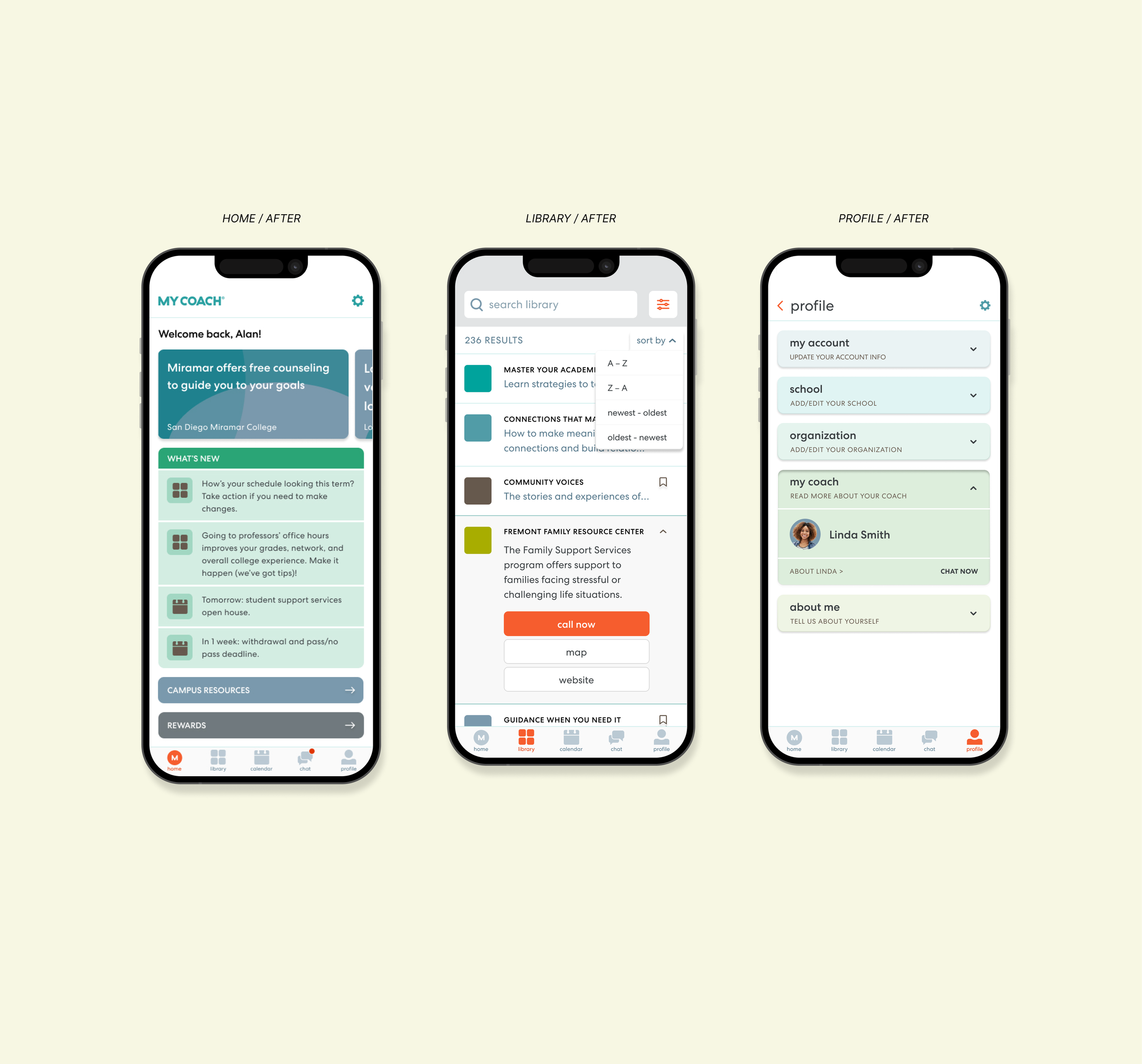
Home
Designed the home screen as a lightweight, motivational hub that guides students toward action without adding cognitive load or development overhead.
Introduced personalized welcome messaging and progress cues to make the experience feel supportive and human.
Reduced visual clutter and text density to improve scannability and tap confidence.
Rebalanced content hierarchy to clearly separate updates, events, resources, and rewards.
Added direct access to high-value features like local resources and rewards to reduce navigation friction.
Designed all enhancements to align with existing UI patterns and developer constraints.
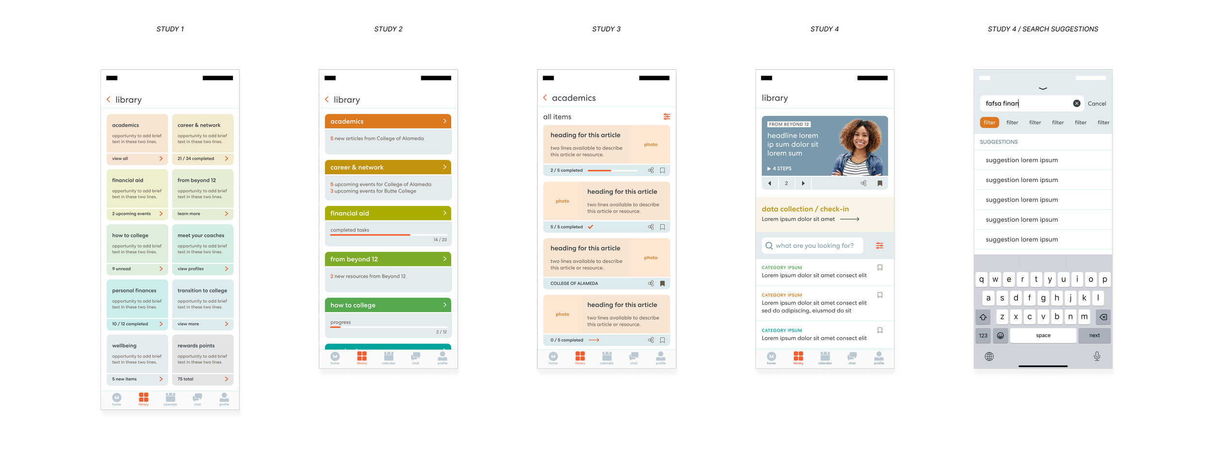
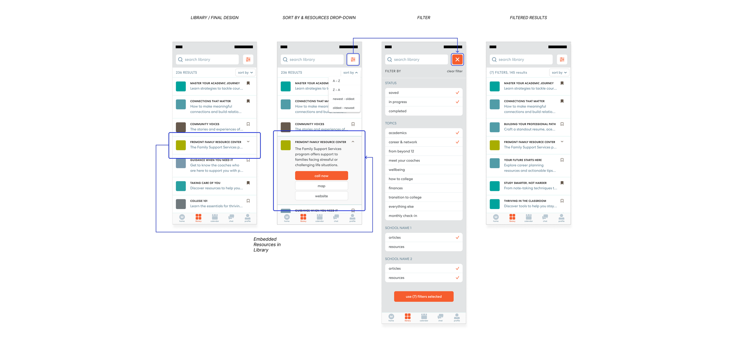
Library & Resources
Rebuilt the library into a discoverable, searchable system that encouraged exploration and repeat use.
Eliminated infinite scrolling by introducing visible search, category previews, and structured content modules.
Integrated Resources directly into the Library to remove feature fragmentation and improve cohesion.
Added multi-select filtering and sorting to help students quickly narrow content based on relevance.
Introduced “Content of the Day” to spotlight high-impact material and drive engagement.
Maintained a clean, lightweight UI that balanced usability with brand consistency.
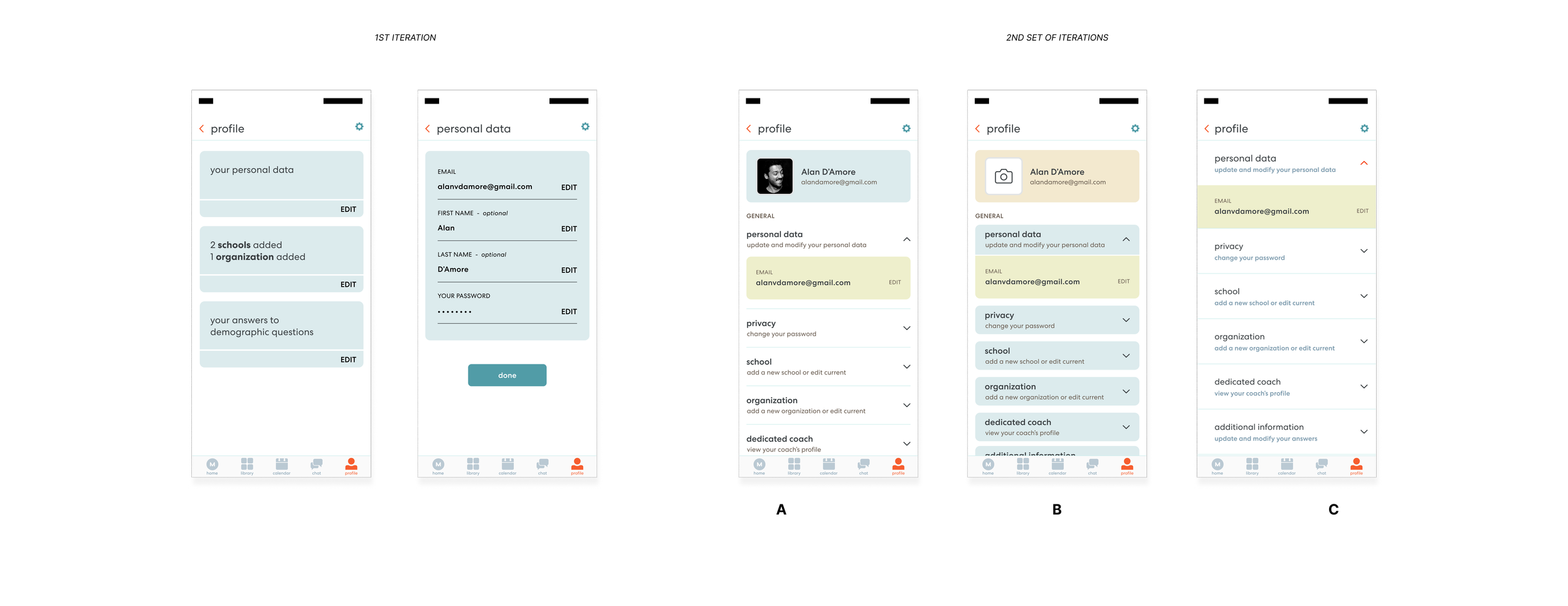
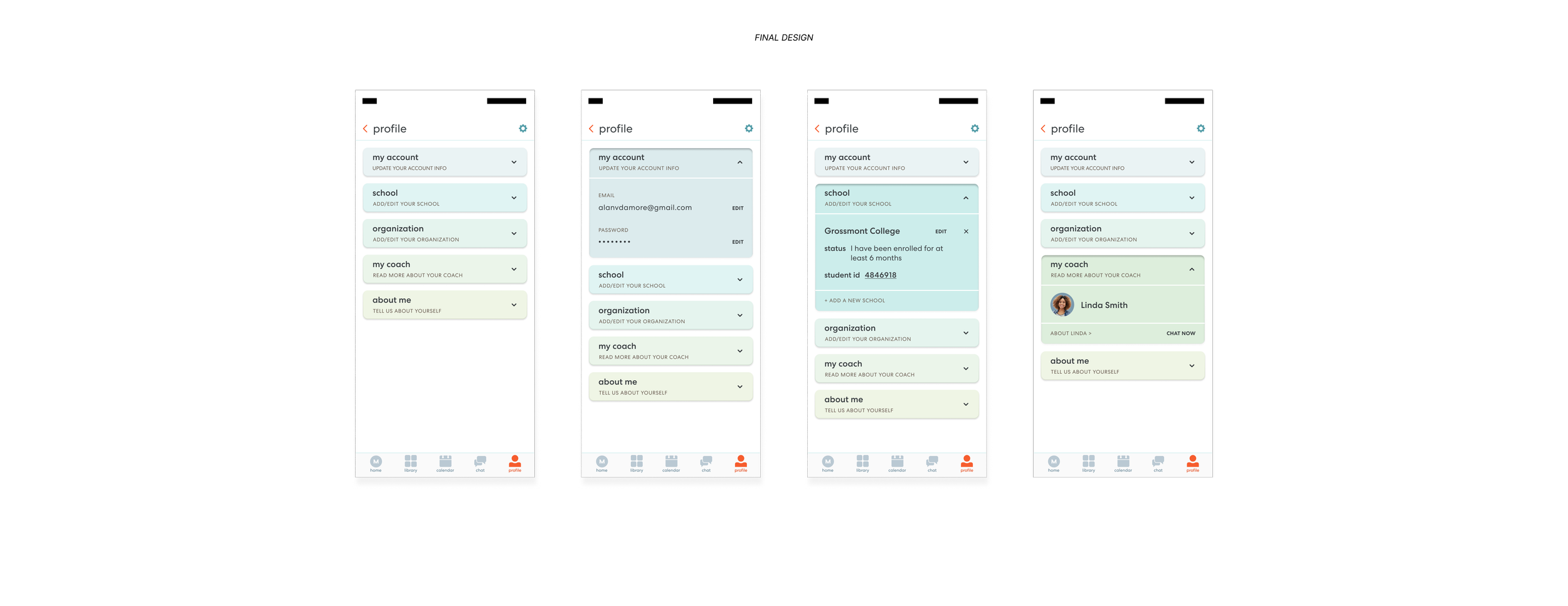
Profile
Streamlined the Profile experience into a single, organized surface that made personal information easy to understand and manage.
Consolidated scattered profile features into one screen with clear categories and hierarchy.
Introduced collapsible sections to reduce visual noise while keeping information accessible.
Simplified editing flows to minimize complexity and support faster development.
Added a dedicated coach section to strengthen the student–coach connection.
Used color-coding and improved copy to guide users and reduce confusion.
Metrics
→ Increased daily engagement across Home, Library, and Profile through clearer navigation and reduced friction
→ Improved content discovery and usage driven by search, filtering, and library restructuring
→ Reduced user confusion and support friction after streamlining Profile and core entry points