Mi Jardín
A bold, nature-rooted wellness brand built from scratch, born from the mountains of Ecuador. From early brand strategy to packaging and storytelling, this case study captures the journey of crafting Mi Jardín, off-grid, with purpose and heart.
PROJECT SNAPSHOT
-
Brand Strategist, Visual Designer, Creative Lead, Content Creator.
-
May 2024 — Present.
Phase 2: completed — Phase 3: Marketing Materials + Merchandise. -
Brand positioning & strategy
Visual identity & logo development
Tone of voice and storytelling direction
Packaging concepts
Merchandise design
Social media framework
Website design planning
-
Full brand guidelines
Logo & visual identity system
Packaging and merch mockups
Content for social exposure & marketing
Story-driven launch plan
Website wireframes & visual direction
QUICK WINS (SO FAR)
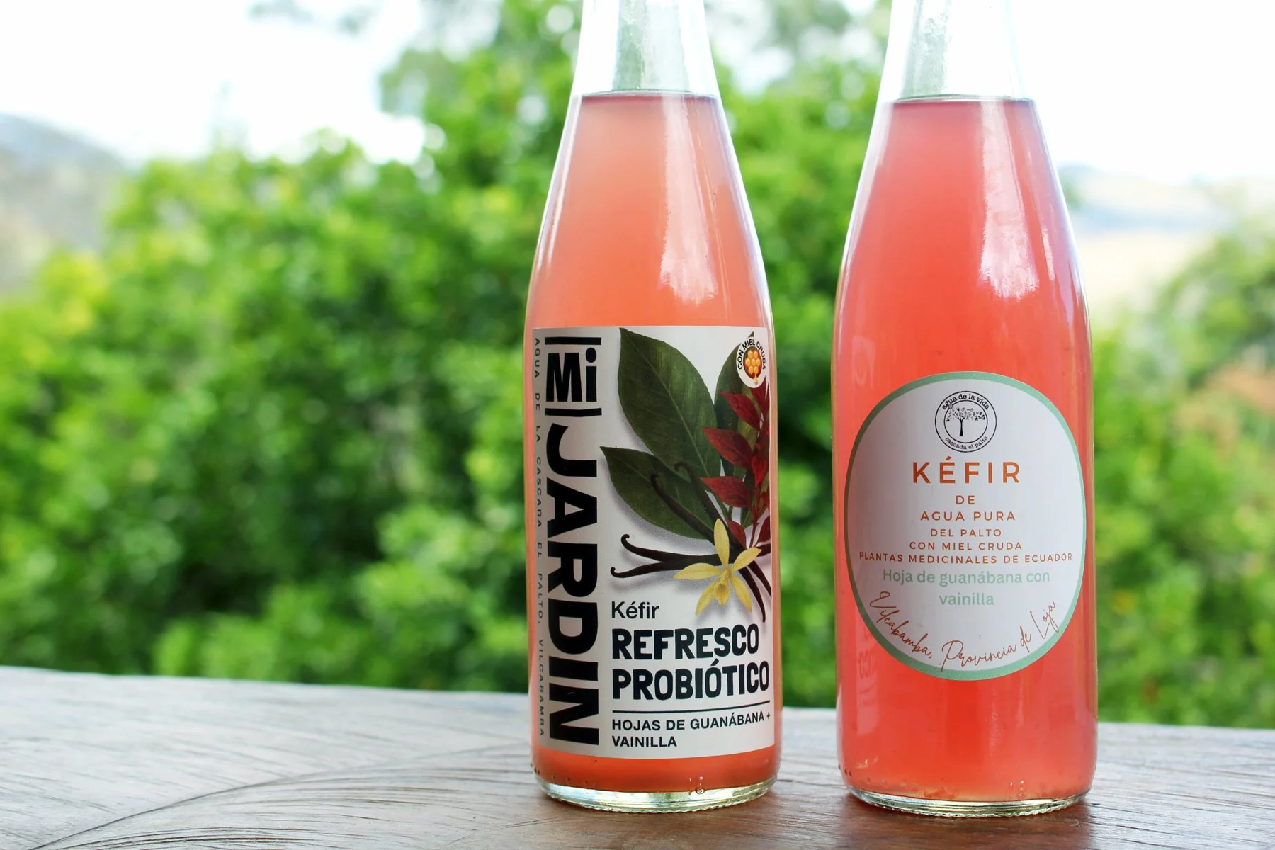
Built a full brand identity for a wellness company producing probiotic drinks, herbal blends, and body care products.
Increased sales by 20% after test labels launched with no promotion.
Secured two additional wholesale clients within one week of Facebook launch.
Completed design for 11 product labels.
THE SETTING
I joined Mi Jardín after meeting founders Claire and Byron while fighting wildfires in Vilcabamba (BLOG 001), Ecuador. Their farm is deep in the Andes, fully off-grid, producing organic products from ingredients grown on-site. Even the water comes from a nearby waterfall.
This wasn’t just a branding job — it was building something that lives its values.
PHASE 1 — BRAND FOUNDATIONS
Core Values
Purity and quality in every ingredient.
Holistic well-being as a way of life.
Sustainability and responsibility in all production.
Connection to Ecuador’s heritage.
Deliverables
Brand name, mission, and values finalized.
Brand hierarchy set: Cascada el Palto (company), Mi Jardín (product brand), SOAK (future body products).
Product categories defined.
PHASE 2 — VISUAL IDENTITY
Creative Process
1—Built three style directions: Botanical Elegance, Vibrant Tropical Vitality, Natural Sanctuary. Later refining it into one moodboard to guide design directions. .
2—Designed six quick mockups to spark discussion.
3—Narrowed to two finalists, merged best elements.
4—Chose WCAG-compliant color palette and custom typography blends.
5—Designed 11 product labels, front and side panels included.
Client Feedback
After refining and listening closely to feedback, we landed on a design that echoed traditional artisan craftsmanship. Inspired by old-world apothecaries, the final direction embodies natural remedies and timeless aesthetics with a contemporary touch.
Challenge + AI as Creative Partner
At this stage, one of the biggest challenges was translating our vision for the labels into the right imagery. While I’m an experienced illustrator, the style we needed required a different skillset—so I turned to AI as a creative partner. The challenge shifted from 'I can’t draw this' to 'I need to craft the perfect prompt,' ensuring every illustration hit the right tone and stayed cohesive across the entire brand.
THE MESS (AND WHAT I LEARNED)
Internet
Local dish network slowed workflow to a crawl. Switched to Starlink for reliable uploads.
Gear
Learned drone flying from scratch on borrowed equipment and videography through social media formatting.
Off-Grid Reality
Required to maintain (and fix when needed) water supply, required to hike two hours uphill for supplies, worked through bug bites (that hatched under the skin!), dealt with snake bites, required to feed and load/unload horses for weekly supplies, and harvested 30%-40% of my own food.
Logistics
Balanced design with physical demands of remote living in addition to attending to tourists visiting the waterfall.
Creativity
Realized best ideas came from working alongside the production process, not just behind a screen.
COLLABORATION & WORKFLOW
Weekly partner meetings + open WhatsApp channel.
Notion update board to track design progress, tasks, and decisions.
Integrated partner feedback at each milestone.

CONTENT PREP (PRE-MARKETING)
Defined story pillars and funnel structure for social media.
Secured Instagram and Facebook handles.
Shot first rounds of content at Palanda and Cascada. Visit Blog 002 to learn more.
Tested filming workflow with multi-device setups and CapCut Pro. Visit my Instagram account [designer_off_grid] to see all the practice runs.
RESULTS SO FAR + WHAT’S NEXT
We’re not done yet. The roadmap flipped when I confirmed I’d be returning to the US by the end of September (2025). That meant tackling the work that required me to be on-site first, and leaving the phases that can be managed remotely for last.
This portfolio piece marks a good milestone.
PHASE 2 — BRANDING + IDENTITY is nearly complete, and we’ve already tested the first labels in the market. The results speak for themselves:
+20% sales with no advertising.
Two new wholesale clients within a week of opening the Facebook page, one local and one from Loja.
Here’s how the next phases stack up:
PHASE 3 — MARKETING MATERIALS + MERCHANDISE
Design point-of-sale materials for local markets.
Produce branded merchandise to reinforce visibility.
Begin low-cost, high-impact distribution within Vilcabamba and surrounding towns.
PHASE 4 — SOCIAL MEDIA STRATEGY + ACTIVE MARKETING
Develop a clear posting rhythm and content plan for Instagram and Facebook.
Create visual templates for posts, reels, and stories to speed up production.
Launch storytelling content highlighting the farm, the products, and the production process.
PHASE 5 — PACKAGING REFINEMENT + BRAND GUIDELINES
Continue refining packaging as products roll out.
Document final brand guidelines, including identity assets, typography, colors, and usage rules.
Deliver a complete package for the client to manage and grow the brand independently.
BEFORE I LEAVE ECUADOR
Push Phase 3 deliverables into production.
Oversee initial rollout of marketing materials.
Ensure packaging refinements are on track.
Set up systems so the remaining phases run smoothly once I’m remote.
WHY THIS PROJECT MATTERS
Mi Jardín proves that design built from lived experience carries more weight. The brand reflects its environment, which is honest, sustainable, and deeply connected to place.
For me, this hasn’t been about pushing pixels. It’s been about designing with the land, the people, and the story at the center.
Choosing Mi Jardín is a conscious vote for products that honor health, nature, and community. In a world overwhelmed with choices, this brand represents a deeper truth: that real wellness comes from integrity, intention, and genuine connection.
Mi Jardín is about taking ownership of our choices, recognizing that what we consume impacts us, our community, and the planet. It's about nourishing ourselves deeply, authentically, sustainably and without compromise.
Every bottle is a story that’s been crafted by hands, born from pure ingredients grown right here, in an untouched paradise. Mi Jardín is a movement toward mindful living, inspiring us to slow down, reconnect, and choose consciously, every single day.